HTML and CSS Email vs. Web
UpdatedQuite often, our customers code their own email templates or receive them from a developer, and we’ll get questions asking why a given email looks different between what’s been coded, what’s shown in Customer.io, and what’s sent to a particular person.
There are a couple of reasons for this:
- HTML and CSS work differently in emails and the web.
- Emails and how they’re laid out (Layouts) both work a little differently in Customer.io
In this doc, we’ll try to explain reason #1, show how those differences manifest in emails, and hopefully give some good advice for how to move forward. (Here’s more info on reason #2.)
Why does this happen?
Coding for the web is code for browsers. There’s an accepted standard. We use semantic HTML and CSS. HTML like header, footer and paragraph tags add meaning to the content inside, and external CSS gives style and structure (things like display, float, or font-family).
Emails, however, are a whole different kettle of fish. They’re opened and read in a huge variety of clients with no one standard between them. And therein lies the problem:
Email client inconsistencies
Desktop, web, and mobile email clients all use different engines to render an email. (E.g., Apple Mail, Outlook for Mac, and Android Mail use WebKit. Outlook 2003 uses IE, while Outlook 2013 uses Word.) Web clients will use the browser’s engine. This variety means that your emails will likely look different across browsers, because…
- separate CSS files are a no-go. All code has to go in the email.
- any CSS that isn’t inlined is usually stripped.
- no CSS shorthand!
- clients might add their own CSS. For example, Gmail will set all
<td>fonts tofont-family: Arial, sans-serif. They might also do funny things like strip out lines of code that begin with periods. - your images are likely blocked by default, and a user may or may not see them.
- forms are inconsistent, as are videos (but gifs are mostly supported!)
- “responsive” emails are difficult and support for what “responsive” means can change across clients.
- CSS properties like
display: none;aren’t supported everywhere, and neither are rounded corners. - font support beyond the basic isn’t great, either
As a result, an email that looks one way in the code editor might look different in Customer.io, might look different in Alice’s email client, and might look different in Bob’s email client.
Some examples
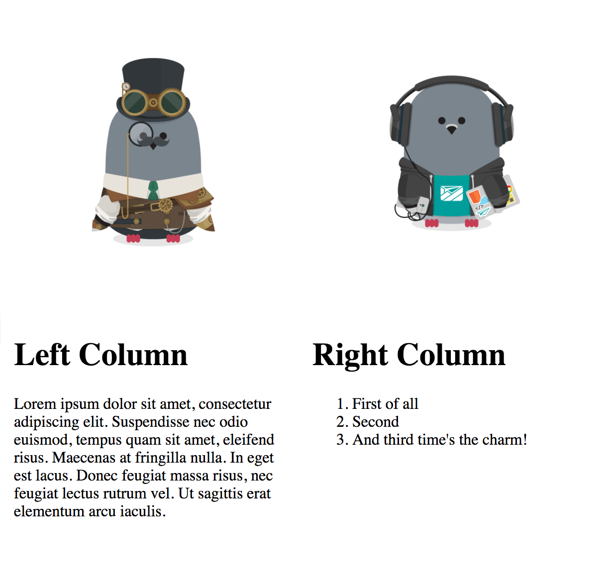
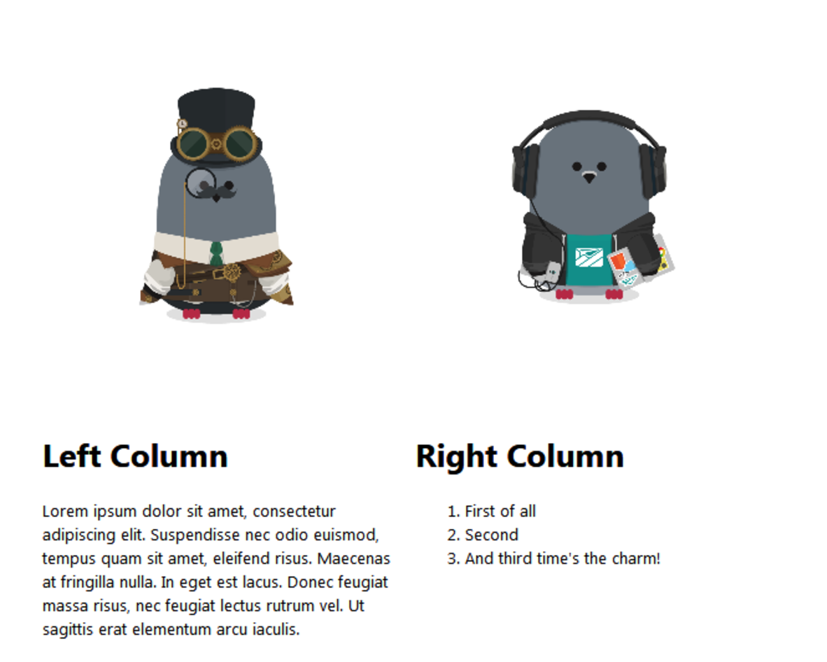
I made a simple table email which looks like this in the browser:
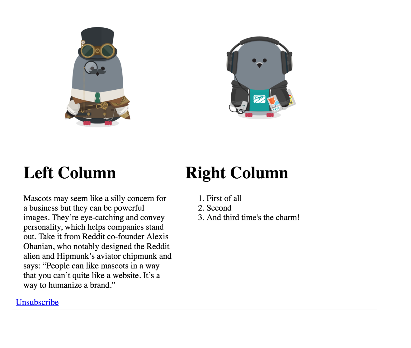
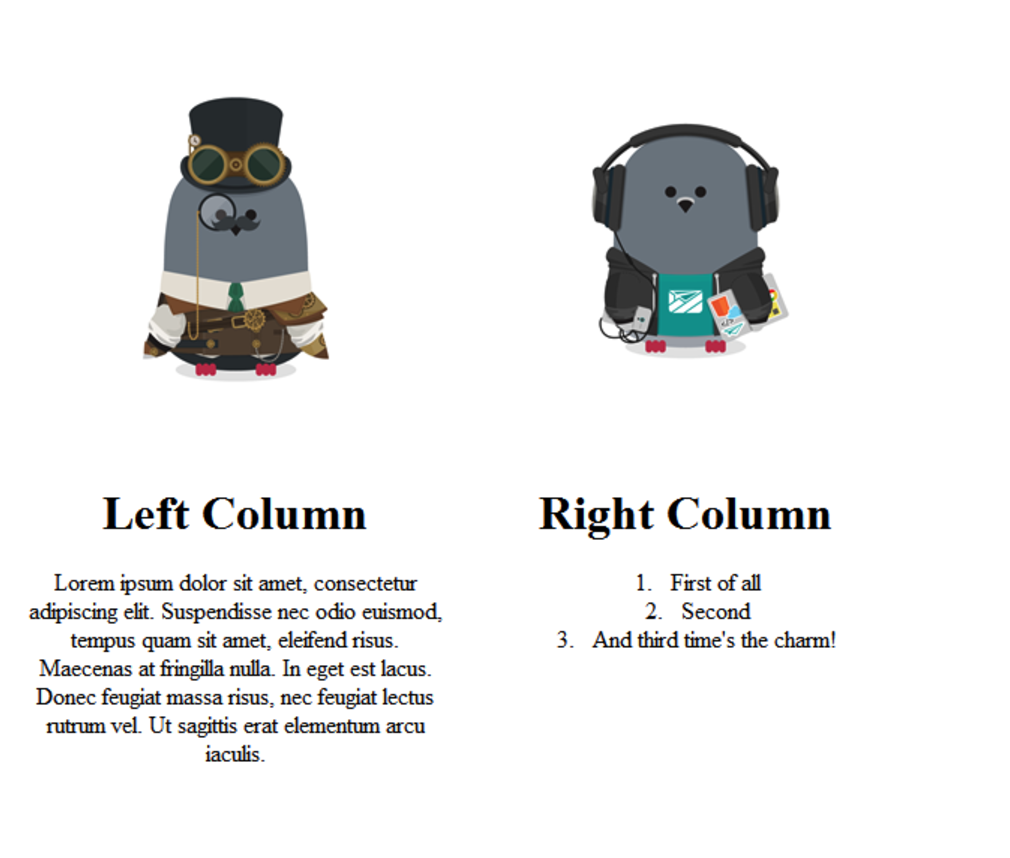
In the Customer.io Preview, it looks like this:
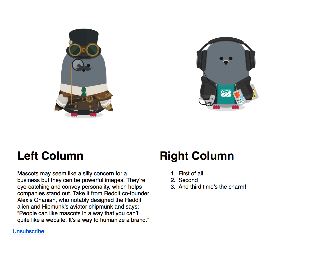
Meanwhile, here it is sent as a test to couple of mail clients, starting with my Apple Mail desktop client.
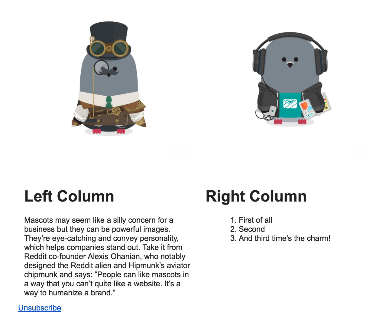
Gmail in Chrome:
Yahoo! Mail in Firefox:
and Outlook 03 in Windows 7:
You can see how this might be a headache!
What you should do
Unfortunately, some of this is unavoidable. Inconsistencies like the above will occur in rendering; different processing happens at different times! However, all is not lost. Once you understand the above, you’re well-placed to understand Customer.io and Layouts (both in and out of the app), and make your emails beautiful!
Step 1: Understand Customer.io email
How email works in Customer.io is pretty simple:
ICYMI, we’ve got some email basics for you in this doc— where to write your copy, basic Liquid implementation, and testing.
Step 2: Understand Customer.io Layouts
Different services call these different things— Layouts, Templates, etc. In Customer.io, we decouple your email layout (how it looks) from its content (the words that live in it). Layouts live in one area of the app, while your email content lives in the Composer.
We’ve written a comprehensive explanation of Layouts here - you can learn how to structure your HTML and CSS within Customer.io, and where the code lives!
Step 3: Customize your emails!
There’s a couple of ways you can do this. You can either start with something pre-built, which a lot of folks do, or from scratch.
How to adapt a template
This process is pretty straightforward once Layouts are understood. Here’s a couple of initial guides we’ve written with email layouts from popular frameworks:
Once you see how these are done, it should be easier for you to adapt your own! If there are guides you’d like to see, let us know!
Code your own
Feeling confident? Awesome! You can start from scratch and code your own email from the ground up. When coding, remember:
- Tables are your friend! Use these for your layout rather than semantic HTML.
- Inline CSS: Because browser-based email applications like Gmail, strip out
<head>and<body>tags by default, you should always use inline CSS. We try to do this for you with Premailer. But you can also:- write CSS inline as you go,
- use a web-based CSS inliner such as Foundation’s Inliner
- Don’t rely too much on images, because of blocking
- If you need to, you can target specific clients. For example, Outlook:
<!--[if mso 12]>Only Outlook 2007 will see this.<![endif]-->
Test, test, test!
We can’t emphasize this enough. Test your email code before sending! At Customer.io, we recommend Litmus.
Simple =/= boring!
Basic doesn’t have to mean boring. You can still do cool stuff! It’s just different, and a little more difficult. Until email code catches up, there will be differences between web and email— but with a bit of testing, your emails can still be as beautiful as you want them to be.
Want to read more, or need more help?
Here’s a few great resources on HTML, CSS, and how they differ for web vs. email:
- Lee Munroe’s excellent article on how to build HTML emails
- Campaign Monitor’s breakdown of the CSS support for the top 10 most popular mobile, web and desktop email clients
- More CSS support
- The Tyranny of Tables: Why Web and Email Design are So Different
