Slots: create modifiable, placeholder content
BetaThis feature is new and we're actively working on it. UpdatedAdd slots to determine what content you can modify in the visual editor of Design Studio. You can create text-based slots or drop-zones for components.
Use our Design Studio GPT to create a custom component!
Learn how to best utilize our GPT to create code for reusable, custom content.
How to create a slot
To create a slot, define the type of slot in <script> and insert <slot> tags in the <template> where you want users to insert or edit content. You can also add placeholder text to guide your team when they’re working in the visual editor.
To define a slot, export the slots variable for use in the visual editor and define your validation schema in the <script> tag.
<script>
  export const config = {
    "label": "My paragraph",
    presets: [
        {
          label: "My paragraph",
          content: `<my-paragraph></my-paragraph>`
        }
    ]
  };
  export const slots = Component.defineSlots({
    default: {
      schema: Component.slots.text(),
      marks: ['bold', 'italic', 'underline', 'strikethrough', 'link']
    },
  });
</script>
<template>
  <p>
    <slot>Add text</slot>
  </p>
</template>
In this example, we added validation for text through schema: Component.slots.text(),. You can also add validation for drop-zones for other components.
Inside the <template> tag, you’ll add <slot> tags where you want teammates to edit text or drop in components. Within the <slot> tag, you can also define placeholder, fallback text. In this example, after you drag this component into the visual editor, you’ll see “Add text” in the visual editor until you edit it.
You can also define multiple slots in a component file.
Define your slot
You can define slots in a few ways:
- As text -
Component.slots.text() - As a container for any other components -
Component.slots.any() - As a container for specific components -
Component.slots.children(['component-name-1', 'component-name-2'])
Add text that users can edit and format
To add text, use Component.slots.text() in the schema field. Then, after team members drag this component onto the visual editor, they can edit the text and highlight words to change their marks.
By default, you can edit these marks in the visual editor:
- bold
- italics
- strikethrough
- underline
- code
- superscript
- subscript
- link
- color
To limit which marks are available, specify which ones you want to keep in a marks property.
<script>
  export const config = {
    "label": "component-one",
    presets: [
        {
          label: "component-one",
          content: `<component-one></component-one>`
        }
    ]
  };
  export const slots = Component.defineSlots({
    default: {
      schema: Component.slots.text(),
      marks: ['bold', 'italic']
    },
  });
</script>
<template>
  <p>
    <slot>Placeholder, fallback text</slot>
  </p>
</template>
This is the full list of marks available:
marks: ['bold', 'italic', 'underline', 'strikethrough', 'link', 'color', 'superscript', 'subscript', 'code', 'linebreak']
Notice you can also add linebreak to your slot’s marks. Add this if you want to let teammates in the visual editor create a break in the component’s text by typing shift+enter. This adds <br> to the code.
Similarly, clicking items in the bubble menu adds standard HTML tags like <strong> or <sup> to the code.
Allow any component to be inserted
Use this to define that a slot can take any component; you can drag any component into the slot of the visual editor. Keep in mind, you may not be able to drag some components in if they have specific parents.
<script>
  export const config = {
    "label": "component-two",
    presets: [
        {
          label: "component-two",
          content: `<component-two></component-two>`
        }
    ]
  };
  export const slots = Component.defineSlots({
    default: {
      schema: Component.slots.any()
    },
  });
</script>
<template>
  <slot>Insert components here.</slot>
</template>
Allow only specific components to be inserted
Use this to define that a slot can only take certain components. Add a min to specify a minimum number of children required for the component. Add a max to specify a maximum number of children allowed.
<script>
    export const config = {
      label: "component-three",
      presets: [
        {
          label: "component-three",
          content: `<component-three></component-three>`
        }
      ]
    };
  export const slots = Component.defineSlots({
    default: {
      schema: Component.slots.children(['component-name-1', 'component-name-2']).min(1).max(3)
    }
  });
</script>
<template>
  <div><slot>Drag in component-one or component-two.</slot></div>
</template>
Define placeholder, fallback content
You can define placeholder, fallback text for any custom component. Add text between the opening and closing <slot> tags. When you drag a component onto the visual editor canvas, you’ll see the placeholder content until you modify the component.
<script>
  export const config = {
    "label": "My first component",
    presets: [
        {
          label: "My first component",
          content: `<my-first-component></my-first-component>`
        }
    ]
  };
  export const slots = Component.defineSlots({
    default: {
      schema: Component.slots.text(),
      marks: ['bold', 'italic', 'underline', 'strikethrough', 'link']
    },
  });
</script>
<template>
  <p><slot>Placeholder, fallback content</slot></p>
</template>
Fallback text renders in your source code
For component drop-zones, you can add <x-empty-state/> to your <slot> tag to visually show a drop-zone. For instance, for a component that only accepts certain child components, you could include <div><slot>Insert paragraphs or buttons<x-empty-state/></slot></div> so your teammates know exactly what to do. Dragging in a component replaces the text and drop-zone so they won’t render in your output code.
Define multiple slots
You can also make a component that has multiple editable areas in the visual editor. For instance, here’s a component that adds a basic format to an email (title, body, and an image) where title is a text slot and article is a component slot that takes as many paragraphs as you need—the main content of your message.
Notice in the script, we define two slots—one named title and the other named article. You’ll reference these in the slot elements of the template.
<!--
  Insert this component in your email with the following code:

  <email-body></email-body>
-->
<script>
  export const config = {
    label: "Email body",
    presets: [{
      label: "Email body",
      content: `<email-body></email-body>`
    }]
  };
  export const slots = Component.defineSlots({
    title: {
      schema: Component.slots.text()
    },
    article: Component.slots.children(['x-paragraph']),
  })
</script>
<template>
    <x-heading-1>
        <slot name="title">Greeting text</slot>
    </x-heading-1>
    <x-box>
        <slot name="article">Drag a paragraph here</slot>
    </x-box>
    <x-image width="517px" align="center" margin="20px 0px 20px 0px" src="file-name.png" alt="description-of-image" />
</template>
Define multiple presets with slots in a single component file
This is an advanced use of slots where we join the #slot directive in the script with the <slot> element in the template. This helps you create components with prefilled content that is static and/or modifiable in the visual editor.
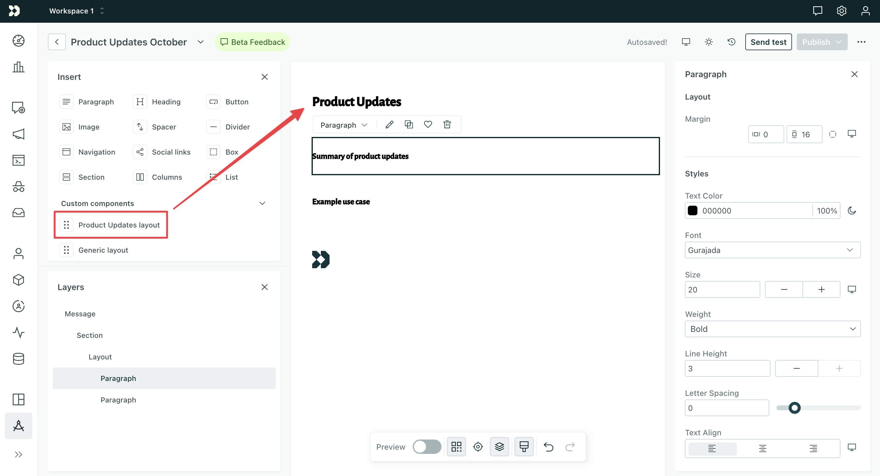
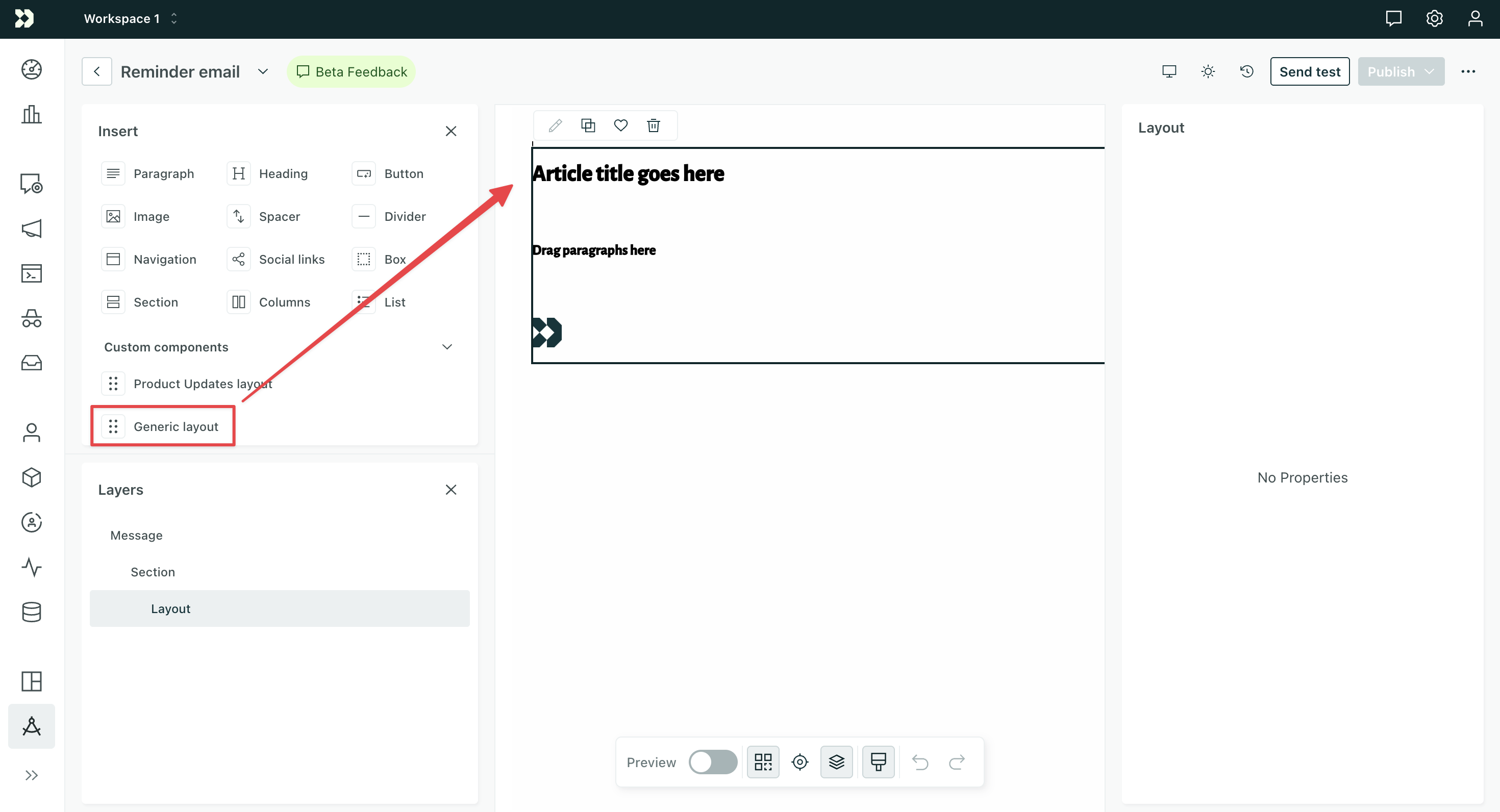
We’ll create a single custom component file with multiple presets, where teammates can drag each preset separately into the visual editor. In this example, there are two presets: “Product Updates layout” and “Generic layout”. Teammates in the visual editor can drag either onto the canvas.
Visual editor:
Component code:
<script>
  export const config = {
    label: "Layout",
    presets: [
      {
        label: "Product Updates layout",
        content: `<article-layout>
          <fragment #slot="title">Product Updates</fragment>
          <fragment #slot="article">
            <x-paragraph>Summary of product updates</x-paragraph>
            <x-paragraph>Example use case</x-paragraph>
          </fragment>
        </article-layout>`
      },
      {
        label: "Generic layout",
        content: `<article-layout></article-layout>`
      }
    ]
  };
  export const slots = Component.defineSlots({
    title: {
      schema: Component.slots.text()
    },
    article: Component.slots.children(['x-paragraph']),
  })
</script>
<template>
    <x-heading-1>
        <slot name="title">Article title goes here</slot>
    </x-heading-1>
    <x-box>
        <slot name="article">Drag paragraphs here</slot>
    </x-box>
    <x-image width="5%" margin="20px 0px 20px 0px" src="file-name.png" alt="company logo" />
</template>
The Product Updates layout pre-populates both the title and article slots with content. Team members can’t edit the title, but they can modify the content within the article as well as add or remove paragraphs. The bottom of the layout includes a static image, defined in the template.
The Generic layout leaves the slots empty so team members can add their own content, but they’ll see the placeholder content in the template. They can modify the title and article and add/remove paragraphs. The bottom of the layout includes the same static image.
Fragment elements don’t render in output
<fragment> element is a special element that groups content without rendering an actual HTML element in your final email. This is perfect for slot content where you don’t want to add extra wrapper elements.