Dark mode
BetaThis feature is new and we're actively working on it. UpdatedYou can customize how your message appears in dark mode when a user’s device or inbox is set to that preference.
Why set dark mode styles?
Dark mode is increasingly the default setting across devices and email clients. As customer expectations shift toward modern design standards, supporting dark mode helps:
- Reduce broken email experiences by providing intentional styling
- Increase readability with properly contrasted colors designed for dark backgrounds
- Meet accessibility standards and user preferences
- Reduce support complaints about poor email rendering in dark mode
Where to set dark mode styles
You can set default, global dark mode styles in Styles. You can also modify dark mode styles of standard components while editing an email and code custom components to support dark mode.
To set dark mode for global styles, go to Set global styles.
In this article, you’ll learn how to set dark mode styles on standard and custom components, the building blocks of Design Studio emails.
- With standard componentsA pre-built block that helps you build beautiful, engaging messages as quickly as possible in Design Studio., you can set dark mode styles without any code in the visual editor.
- With custom componentsA custom block of code with content and properties you can reuse across messages made in Design Studio., we’ll show you how to add dark-mode enabled properties and create
@mediaqueries to support more email clients.
Inbox limitations & best practices
When creating emails in Design Studio or other email building tools, the preview won’t always match what people see in their email inbox. This is due to how email clients sanitize code to ensure no malicious code is included in the email file.
As such, not all email clients support dark mode styles or they support them in different ways:
- In Gmail, if the theme is set to dark mode, then Gmail forces dark mode and blocks any control from senders.
- Outlook webmail forces dark styles and allows senders limited control of dark mode.
- Notion mail forces dark styles but also allows senders control of dark mode.
- Apple Mail allows senders full control of dark mode.
Keep in mind, some email clients simply follow the settings of the recipient’s operating system when applying dark mode, while others allow separate control in the inbox app. If the operating system and the app have opposing settings, this can lead to further inconsistencies.
Behind the scenes, we use media queries (prefers-color-scheme) to apply dark mode styles. These detect whether recipients have dark mode enabled and attempt to adjust your email’s colors accordingly. Learn more about which email clients support this at Caniemail.
Dark mode vs Forced dark mode
After you turn on the Preview toggle in the visual editor, you’ll see options to preview styles in Dark mode or Forced dark mode.
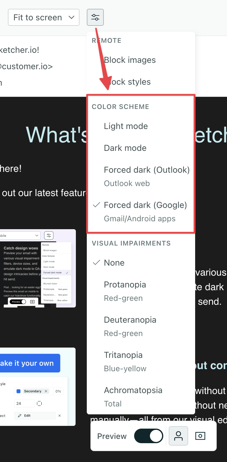
- Dark mode represents what recipients will see if their email client fully supports dark mode media queries.
- Forced dark mode represents what recipients will see if Dark mode is enabled but media queries aren’t supported by their email client. Learn more about Forced dark mode for Outlook and Android apps.
The tips below will help you make the most visually appealing email, no matter the email client.
Reduce inconsistencies when dark mode styles aren’t supported
Here are some tips for making your email more consistent across all email clients.
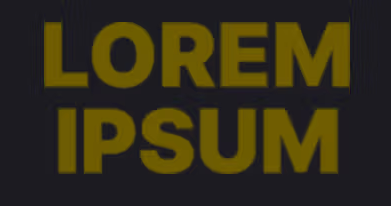
Set a solid background color between a background image & text
You should avoid using background images or gradients directly behind text. With forced dark mode, the text color may invert but the background won’t, which can make text unreadable. For instance, if your white text inverts to black but your dark background image remains unchanged, your text becomes invisible (black text on dark image).
If you must use a background image, try one of our workarounds that sets a background color between the image and text so your text remains visible if the color inverts:
- In the visual editor, insert a box with a background color between your text element and the element with the background image.
- In the code editor, insert a
<div>tag around the text and set a background color.
In the visual editor, you can insert a box with a background color between your text element and the element with the background image.
- Drag your text into a box then drag that box into the container with the background image.
- Click the box and set a background color in the properties menu so your text is visible even if the color inverts. You could reduce the transparency so some of the background image remains visible too.
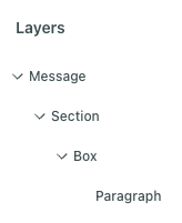
If your text is in a paragraph component and a section component contains the background image, this is what the Layers menu should look like:
In the code editor, add a <div> tag around the text and set a background color.
- Switch to the code editor in the top right.
- Locate your text element. It might be helpful to click Format Document above the editor then click Inspect Element at the bottom of the preview. In Inspect Mode, you can click the text element in the preview, and it will highlight the code for you.
- Wrap a
<div>tag around the text element. - Set a background color on the
<div>tag. For instance, if your text is in a paragraph component and your image is in a section, you’d wrap the<div>tag around the paragraph and set a style attribute.
<x-section outer-background="url('<link-to-image>')">
  <div style="background-color:#f9d930">
    <x-paragraph :color="{ light: `#000000`, dark: `#ffffff` }">Welcome aboard!</x-paragraph>
  </div>
</x-section>
Add a background or border to images
If you’ve added an image that has a transparent background, like a logo, forced dark mode could invert the background behind the image which could prevent the image from standing out. To work around transparent backgrounds, modify the original file to have a background color or border that helps it stand out no matter what.
For instance, here’s an example of a logo in light mode and dark mode with different options:
| Light mode | Dark mode | Dark mode: image w/ border | Dark mode: image w/ background |
|---|---|---|---|
 |  |  |  |
Use a black & white color scheme
If you don’t like the colors inserted by forced dark mode, you could convert your email to use only black, white, and shades of gray. Forced dark mode more predictably inverts this color scheme.
Add dark mode styles to standard components
You can globally set dark mode styles for standard components in Styles. You’ll define your colors under Variables then assign these variables to light or dark mode for standard components under Components.
You can also change the styles for individual emails that deviate from your global branding.
To change a dark mode color through the visual editor:
- Click a standard component.
- Find a color property like text color, background/fill, or border color.
- Set your default color or choose a different global style variable.
- Click the moon icon to open dark mode.
- Set the color for dark mode or choose a different global style variable.
- Click the moon toggle at the top of the editor to preview your message in dark mode.
Your changes save automatically. Remember to publish your changes if the email is connected to a campaign, broadcast, etc.
This feature also supports the email client Thunderbird so our out-of-the-box dark mode styles are compatible with more email clients!
Swap images based on dark mode
You can specify dark vs light modes of an image in the Properties menu. This is available for the Image component and background images for containers like sections.
Image components
To swap images based on dark mode, follow these steps:
- Click an image component.
- Click next to Source.
- Click Add dark mode properties.
- Under , add the image URL or select a file for light mode. This is the default, fallback image.
- Under , add the image URL or select a file for dark mode.
- Click the toggles at the top to preview dark vs light modes of the image.
Background images
To swap background images based on dark mode, follow these steps:
- Click a container component, like a section.
- Under Background, click Add Fill then select Image.
- Add the image URL or select a file for light mode. This is the default, fallback image.
- Click then add the image URL or select a file for dark mode.
- Click the toggles at the top to preview dark vs light modes of the image.
Add dark mode styles to custom components
Currently, you’ll have to code dark mode into custom components. Try out our GPT made for custom components to get started faster!
- Create a custom component file.
- Create properties with schema that enable dark mode.
- Set a function to define the values of properties depending on if they’re objects or strings.
- Set variables to process the property values.
- Create a style object that references your variables.
- Reference the style object in the template.
In this example, we’ll create a custom component so you can specify dark mode styles for background and text colors through the visual editor.
<!--
  Insert this component in your email with the following code:

  <dark-mode-test></dark-mode-test>
-->
<script>
  export const config = {
    label: "dark mode test",
    presets: [
      {
        label: "dark mode test",
        content: `<dark-mode-test></dark-mode-test>`
      }
    ]
  };

  export const slots = Component.defineSlots({
    default: {
      schema: Component.slots.text(),
    },
  });

  export const props = Component.defineProps({
    'background':{
      section: 'Styles',
      label: 'Fill',
      schema: Component.props
        .withDynamicStyles(Component.props.string(), {
          darkMode: true,
      })
      .optional(),
      type: 'background',
    },
    'color':{
      section: 'Styles',
      label: 'Color',
      schema: Component.props
        .withDynamicStyles(Component.props.string(), {
          darkMode: true,
      })
      .optional(),
      type: 'color',
    }
  });

  function lightDark(value) {
    if (typeof value === 'object') {
      return {
        light: value.light || '',
        dark: value.dark || undefined,
      };
    }
    if (typeof value === 'string') {
      return { light: value, dark: undefined };
    }
  }

  const newColor = lightDark(props.color);
  const newBackground = lightDark(props.background);

  const styleObject = {
    color: newColor?.light,
    background: newBackground?.light,
  };
</script>
<style #if="newColor?.dark || newBackground?.dark">
  @media (prefers-color-scheme: dark){
    .dark{
      color: set(newColor?.dark) !important;
      background: set(newBackground?.dark) !important;
    }
  }
</style>
<style  #if="newColor?.dark || newBackground?.dark" media="(prefers-color-scheme: dark)" isolated="thunderbird">
  .moz-text-html .dark{
      color: set(newColor?.dark) !important;
      background: set(newBackground?.dark) !important;
    }
</style>
<template>
  <div :style="styleObject" class="dark">
    <slot>Content goes here</slot>
  </div>
</template>
Create dark mode-enabled properties
If you’re building a custom component and want it to support dark mode, any properties that should respond to theme changes, like colors or backgrounds, must be marked as dynamic.
Use .withDynamicStyles() in your property schema to ensure those styles update automatically when the theme changes.
schema: Component.props
  .withDynamicStyles(Component.props.string(), {
    darkMode: true
  })
  .optional(),
Component.props.string()is one of the validation types you can use to define your property.darkModeis a boolean. After you’ve added your custom component to the visual editor, click it to open the Properties panel. WhendarkModeis set to true, you’ll see the dark mode moon toggle in the panel. Click it to set the style.
Set a function to handle light/dark property outputs
This function sets up the ability for your custom component to pass light and dark mode values, ensuring that you always get an object with both light and dark properties, even if one or both are not explicitly provided in the initial input.
  function lightDark(value) {
    if (typeof value === 'object') {
      return {
        light: value.light || '',
        dark: value.dark || undefined,
      };
    }
    if (typeof value === 'string') {
      return { light: value, dark: undefined };
    }
  }
Set variables to process the property values
Then define two variables, one for the text color and one for the background color, to use in a style object we can reference in our template.
const newColor = lightDark(props.color);
const newBackground = lightDark(props.background);
Create a style object to reference in your template
Finally, add a style object to the script tag so you can reference these properties in the template.
const styleObject = {
  color: newColor?.light,
  background: newBackground?.light,
};
Add your style object to the template
Now you can reference the style object in the content of the custom component through the template tag.
<template>
  <div style="styleObject">
    <slot>
      Content goes here
    </slot>
  </div>
</template>
Add @media queries to support more email clients
After your script tag, add style tags to define dark mode styles.
Here we’ve added two style tags. The first includes a generic media query that sets a class dark. The second isolates styles needed to support Thunderbird. Learn more about the attribute prefers-color-scheme
<style #if="newColor?.dark || newBackground?.dark">
  @media (prefers-color-scheme: dark){
    .dark{
      color: set(newColor?.dark) !important;
      background: set(newBackground?.dark) !important;
    }
  }
</style>
<style  #if="newColor?.dark || newBackground?.dark" media="(prefers-color-scheme: dark)" isolated="thunderbird">
  .moz-text-html .dark{
      color: set(newColor?.dark) !important;
      background: set(newBackground?.dark) !important;
    }
</style>
Then in the template tag you’d add class="dark".
<template>
  <div :style="styleObject" class="dark">
    <slot>Content goes here</slot>
  </div>
</template>