Add components to your message
BetaThis feature is new and we're actively working on it. UpdatedAdd components to the visual editor of Design Studio to start building your message. After you’ve dragged a component to the canvas, you can adjust the settings to modify its appearance.
Insert components
You can add standard or custom components to your message by dragging them onto the canvas from the visual editor’s Insert menu. Standard Components appear at the top of the menu. Collapse the folder and you’ll see Custom Components immediately below. If you haven’t created custom components, you’ll only have the option to drag in standard components.
Click and hold any component then drag and drop it onto the center canvas.
If you switch to the code editor, you can type x- to choose from a list of available standard components.
Modify content
Once you’ve dragged a component to the canvas, you can start modifying the text or asset. For example, if you drag a Paragraph component, you can start typing to add text to your message.
Add an image
After you drag an Image component onto your message, select a file from assets you’ve already uploaded or upload an image that is 2 MB or smaller, with a width and height no greater than 4096 px. You can also add a hosted image to Source in the Properties menu. For best performance, you should use .jpg, .png or .gif file types. Some email clients don’t fully support more modern formats.
Add space
We recommend you use margin or padding properties where possible to add space between content. However, if for any reason those properties don’t fulfill your needs, you can use the Spacer component to add vertical spacing.
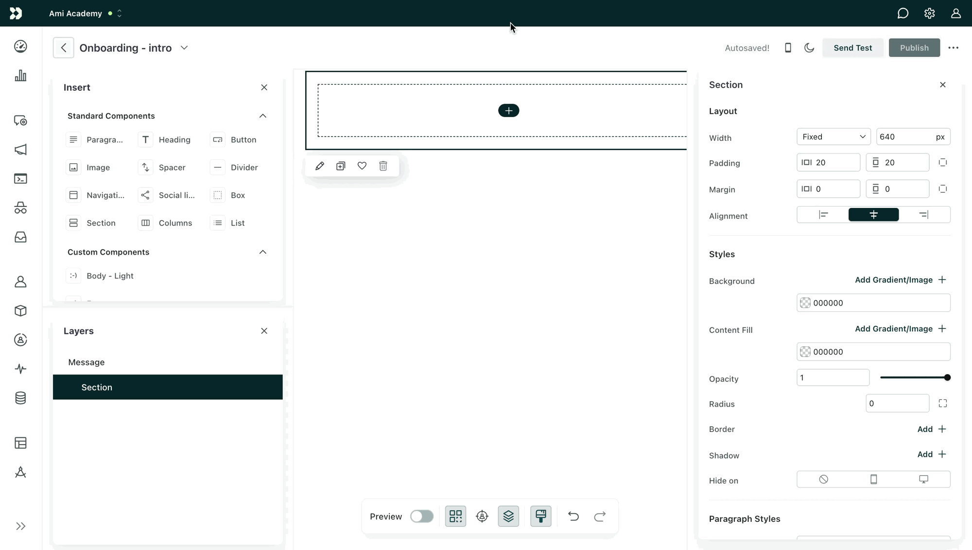
Edit component settings
Click a component on the canvas and you’ll see a menu where you can perform actions like duplicating or deleting it. You can also highlight text to quickly change basic styles.
Click the pencil icon to open the Properties menu on the right. For standard components, you’ll see a list of common settings like color or font family and can also scroll down to Advanced to add your own inline CSS properties. For custom components, you can modify settings as defined in their source files.