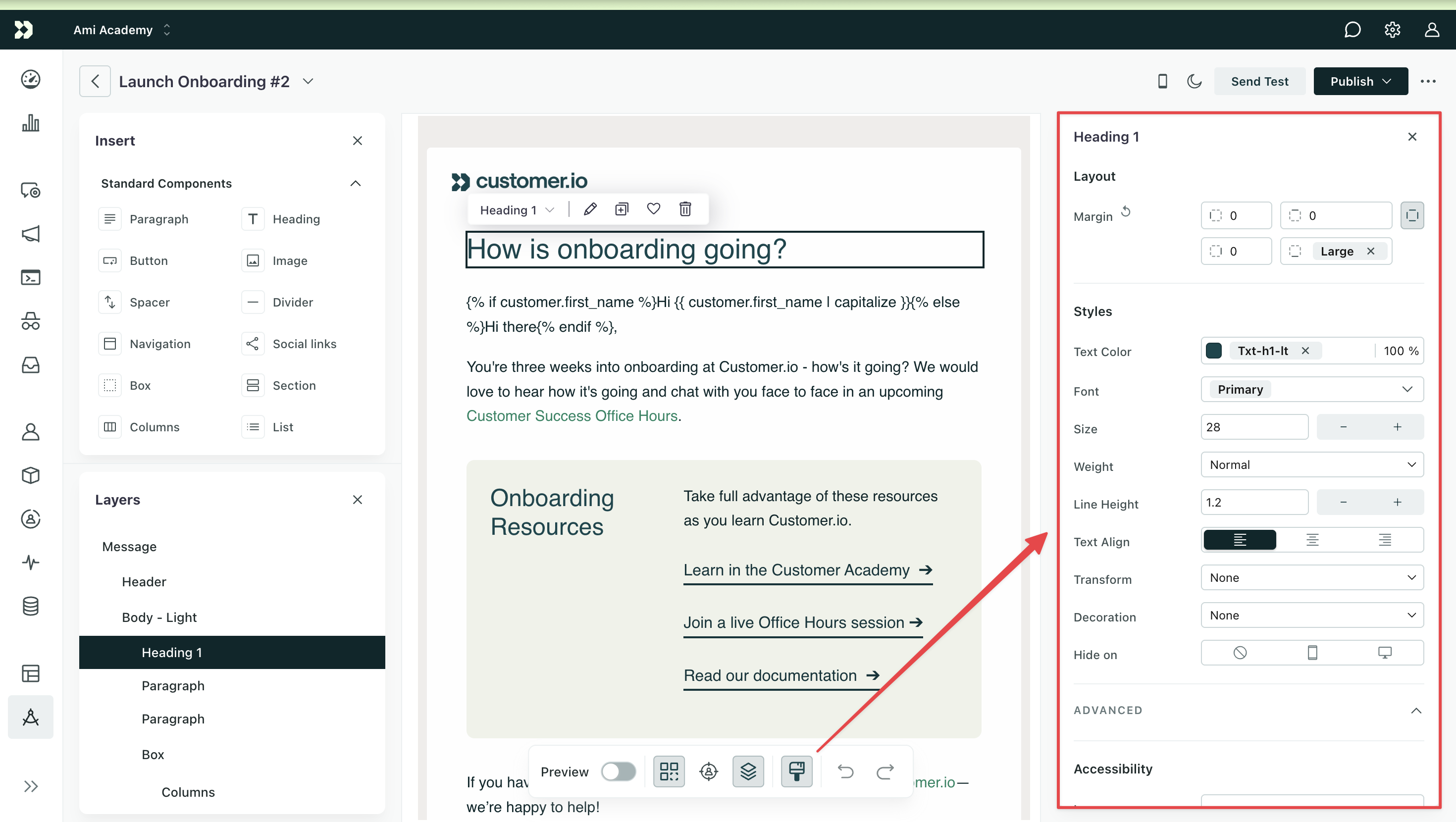
Style your messages using the Properties menu
BetaThis feature is new and we're actively working on it. UpdatedIn Design Studio, the Properties menu lets you style each component of your email. You can adjust layout, set backgrounds, apply text styles, and control how components display on different devices.
Global styles vs message styles
By default, components pull from your Global Styles—like text, link, and button styles. If you want to change these for an individual message, you can override them in the Properties menu.
- To override styles for a group of standard componentsA pre-built block that helps you build beautiful, engaging messages as quickly as possible in Design Studio., add them to a container (like a section, box, or column) and modify the container’s styles—the components will inherit these.
- To override a single standard component, modify the style in the Properties menu.
- To override a piece of a component (like the text color of a word), highlight it then modify the styles in the Bubble menu.
- To change the styles of a custom componentA custom block of code with content and properties you can reuse across messages made in Design Studio., you may be able to edit the styles from the Properties menu depending on how it was coded.
Apply styles to a component
To style a component:
- Click an element on your canvas.
- Use the Properties menu to edit styles like font, color, padding, borders, and more.
- Preview your changes.
If you want to reset the component’s property to its default value, click the counter-clockwise arrow next to the property name.
You can also edit shared styles across multiple components at once. For instance, if you want to change your paragraphs to have the same font color, first click and drag your cursor to select them all, then edit the color in the Properties menu.
Set a background
You can add a background to most components using a solid color, gradient, or image.
Not all background types are available for every component. Check out which components support backgrounds.
If you want to set a background for your entire message, click Message under Layers. If the Layers menu is closed, click the layers icon on the canvas toolbar to open it.
Solid color
To set a solid background color for a component:
- Click the component you want to modify.
- Under Styles, locate the Background or Content Fill field. Enter the hex value of the color and the opacity percentage, or click the preview icon to choose a color and opacity.
- Preview your changes and send a test to see how it renders in your email client.
To reset your background color, click the counter-clockwise arrow icon to the left of the field. To remove it, click the icon to the right.
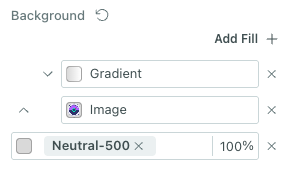
Gradient
To set a gradient as the background of your component:
- Click the component you want to modify.
- Under Styles, locate the Background or Content Fill field. Set a fallback color in case your customers’ email clients do not support gradients.
- Click Add Gradient/Image. By default, we set a linear gradient based on your background color.
- Click the gradient field to change the gradient type or add color stops.
- Modify the layout properties to change the position, size or repeat of the gradient.
- Preview your changes and send a test to see how it renders in your email client.
To remove the gradient, click the icon to the right of the field.
Gradient type: linear or radial
By default, we set a linear gradient. You can change the angle of the gradient by typing a different degree (0-360).
You can also switch to a radial gradient by clicking the radial icon.
We do not support conic gradients.
Color stops
A color stop defines the relative position of a color in a gradient. Every gradient will start with two color stops, but you can add as many as you’d like.
To add color stops, click a location on the top slider. Then choose a color:
- From Recently used colors.
- From the second slider, then change the shade up top.
- By using the eyedropper to identify a color not yet in your email.
Adjust the opacity as you see fit on the bottom slider.
Click and drag a color stop along the top slider to change its position and see how it affects the way your gradient appears in your message.
Click the trash icon to delete the selected stop.
Image
To set an image as the background of your component:
- Click the component you want to modify.
- Under Styles, locate the Background or Content Fill field. Set a fallback color in case your customers’ email clients do not support images.
- Click Add Gradient/Image.
- Click the new field, then choose Image from the pop-up.
- Paste the image URL if hosted outside Design Studio, or click “Select Media” and browse for a file in your workspace.
- Modify the layout properties to change the position, size or repeat of the background image.
- Preview your changes and send a test to see how it renders in your email client. Test with Block images enabled to see how it renders when recipients’ email clients have settings that block images.
To remove the background image, click the icon to the right of the field.
Layout Properties
In the Gradient/Image menu, open the dropdown to edit your layout properties.
Set a custom size if you want to position and repeat a gradient
Position
Choose how to orient your image or gradient.
- Left – Aligns the background to the left edge of the container.
- Right – Aligns the background to the right edge of the container.
- Center – Centers the background horizontally (and vertically, if vertical alignment isn’t separately specified).
- Top – Aligns the background to the top edge of the container.
- Bottom – Aligns the background to the bottom edge of the container.
Size
Control the size of your background image. For gradients, you’ll want to set a Custom size to see changes.
- Auto – Uses the original dimensions of the background image or gradient without any scaling. This is the default behavior if no size is set. Note that in this setting, if the image you add is a different size than your container, you may only see a portion of the image.
- Fit – Scales the background to fit entirely within the container while preserving its aspect ratio. The background will be fully visible, but there may be empty space if the aspect ratios differ.
- Fill – Scales the background to completely cover the container, preserving aspect ratio. Some parts of the background may be cropped to fill the area edge-to-edge.
- Custom – Allows you to specify an exact width, height, or both. For each, you can choose between auto sizing, a fixed pixel value, or a relative percentage value. This is useful when you want precise control over how large the background appears, regardless of container size.
Repeat
Control how the background fills the container when its size is smaller than the container.
- Tile – Repeats the background both horizontally and vertically to fill the entire area.
- Tile Horizontally – Repeats the background only across the x-axis (left to right).
- Tile Vertically – Repeats the background only along the y-axis (top to bottom).
- Space Evenly – Repeats the background with equal spacing between tiles. Tiles will not be clipped or stretched.
- Space to Fit – Scales and repeats the background to fit exactly into the container without clipping. May adjust spacing or sizing to make it fit evenly.
- None – Displays the background once, without any repetition.
Fallbacks when email clients don’t support background images or gradients
If you set a gradient or image as a background, set a solid color as a fallback. Not all email clients support gradients and background images, but they do support solid colors. You can find out more about email client support at Can I Email.
Also note, your background settings are evaluated from top to bottom. For instance, imagine your background starts with a gradient followed by an image and ends with a solid color.
If the email client doesn’t support layered backgrounds (like Yahoo and AOL) or gradients, then we will provide a fallback of the image over the solid background color. If images aren’t supported either, then just the solid color background will render. You can change the order by clicking the arrows to the left of the items in the Properties menu.
Components that support backgrounds
Some standard components support backgrounds, and you can code your custom components to have properties that support backgrounds too:
- For standard componentsA pre-built block that helps you build beautiful, engaging messages as quickly as possible in Design Studio., you can modify the background of boxes, columns, and sections. Consider whether you want a single area to have a background or the entire message:
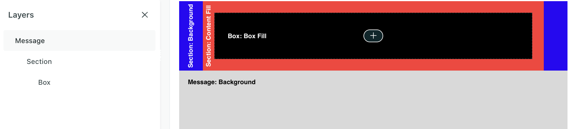
- You can modify the background of your entire message in Message > Properties (gray above).
- A section runs the full width of the message.
- Set Background if you want the color (blue above) to span the width of the message.
- Set Content fill if you want the background color to only span the width of the content (red above). You set the width in Layout in the section’s Properties menu.
- For a custom componentA custom block of code with content and properties you can reuse across messages made in Design Studio., the component code needs a property with type
backgroundbefore you can modify its background in the Properties menu.
You’ll add background styles to HTML elements with CSS. In the Properties menu, add your background under Advanced > CSS style. Check that your code doesn’t break across email clients.
Add a shadow
You can add a shadow to most standard components including containers like sections, boxes, and columns and content like buttons and images.
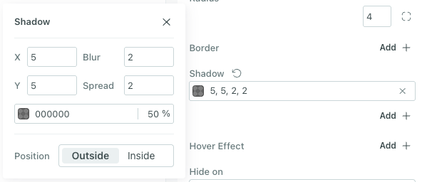
To set a shadow:
- Click the component you want to modify.
- Under Styles, locate the Shadow field. Click Add.
- Then click the box to set your styles.
- The X property is the horizontal offset.
- The Y property is the vertical offset.
- The Blur property is the blur radius. As the value increases, the shadow lightens and expands. The edges become less sharp.
- The Spread property is the spread radius. This determines how large the shadow is. Negative numbers shrink the shadow.
- The Color property is the color of the shadow. Click the color preview to access more options, like your brand colors.
- % is the transparency of the shadow.
- The Position property is whether the shadow is inside or outside the component.
- Preview your changes and send a test to see how it renders in your email client.
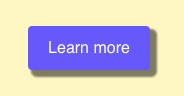
Here’s an example of a button with an outside shadow. On the left is the setup in the Properties menu and on the right is the preview of those settings. The shadow includes a vertical and horizontal offset of 5px. The blur and spread are 2px. The color is gray with 50% transparency. And it’s positioned outside of the button:
| Shadow settings | Preview |
|---|---|
 |  |
Set font weight
When editing any font property, you’ll have the option to set a font weight. Not all fonts support the full list of font weights. If we don’t support the selected weight, you’ll see the next closest one.
Set responsive styles
You can set responsive styles for images, text, and containers as well as hide elements based on screen size. The breakpoint for desktop vs mobile is 600px. Learn how to swap images, hide content, and style based on screen size in our Responsive styles article.
Set dark mode styles
You can add dark mode styles for variables and images. Learn how to set dark mode styles in the visual editor.