Responsive styles
BetaThis feature is new and we're actively working on it. UpdatedHow to set responsive styles
You can set responsive styles in the visual editor or by writing your own CSS.
Set responsive styles in Design Studio
You can set responsive styles for your brand and for individual emails. Our responsive styles have a breakpoint of 600px.
To set responsive styles globally, go to Styles.
To modify mobile vs desktop styles in the visual editor, click a component and locate properties with .
Add custom code in Design Studio
You can code custom styles for features that don’t currently have UI support for responsiveness like text transformations and font families. Check out how to use media queries to accomplish this.
We recommend building your emails mobile-first. This means optimizing your email for smaller device sizes (mobile) then customizing responsive styles for larger device types (desktop).
This is important because a number of email clients don’t support responsive styles, and generally speaking, mobile styles look better on desktop than desktop styles look on mobile.
To build custom, responsive styles in Design Studio:
- Build mobile-first in the visual editor.
- Add custom CSS classes to elements.
- Define
@mediaqueries for larger screens in the code editor. - Add responsive styles.
Inbox limitations & best practices
Email clients can vary from fully supporting responsive styles to not supporting them at all. To help address this, we recommend you:
- Build mobile-first emails as mobile styles tend to look better on desktop than vice versa.
- Preview messages across device dimensions to see if you need responsive styles.
- Preview with styles blocked to simulate what recipients will see when responsive styles are not supported.
Some email clients don’t support responsive styles:
- T-Online
- GMX
- web.de
- Gmail mobile webmail
- Gmail mobile app when used with a non-Google account
In these clients, recipients will see the mobile version of your email by default. Our standard components are built mobile-first since mobile styles tend to look better on desktop than vice versa.
Some email clients have a preview pane for emails, like Gmail webmail, Outlook webmail, and Yahoo webmail, but an email may not display as expected in the pane because the breakpoint is based on the width of the email client app, not the pane itself.
Preview message before adding responsive styles
Before you add responsive properties, preview the email and send yourself test messages to see how it displays across screen sizes. You may not need as many responsive styles as expected because of our fluid layouts.
We built our standard componentsA pre-built block that helps you build beautiful, engaging messages as quickly as possible in Design Studio. scale to any screen size. So it’s possible your emails will look good without you explicitly setting responsive styles!
Preview with styles blocked
If you add responsive styling, preview the email with Block styles enabled to see what the email may look like in email clients that don’t support responsive styles. Then modify your default (the styles under the mobile icon) as needed to improve display.
Add responsive styles to standard components
From the Properties menu, you can set responsive styles for images, text, and containers as well as hide elements based on screen size. The breakpoint for desktop vs mobile is 600px. To set default responsive styles across your Design Studio emails, go to Styles.
Swap images based on screen size
You can specify desktop vs mobile versions of an image in the Properties menu. This is only available for the Image component, not background images.
- Click an image component.
- Click next to Source.
- Click Add responsive properties.
- Under , add the image URL or select a file for mobile. This is also the default image.
- Under , add the image URL or select a file for screens over 600px wide.
- Click the toggles at the top to preview desktop vs mobile versions of the image.
Hide components based on screen size
By default, all components show on both desktop and mobile. You may want to show or hide elements in your message to better support mobile or desktop screens. You’ll use the Hide on setting to control the visibility of components.
Learn more about conditionally displaying content.
Style based on screen size
From the Properties menu, you can set responsive styles for text and containers, like sections or boxes. To set default responsive styles across your Design Studio emails, go to your Styles page.
You can set responsive styles for text, like font size and text alignment, as well as layout properties like width, height, padding, margin, and container alignment for sections and boxes.
In the visual editor, click a component—like a section or image, to open the Properties menu. Then find a field with .
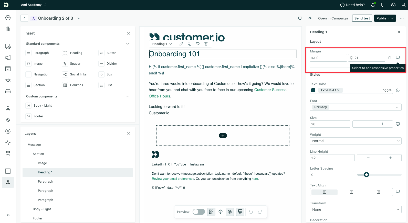
- For screens less than or equal to 600px wide, add the style under .
- For screens greater than 600px wide, add the style under .
To reset to your default styles, click the counter-clockwise arrow icon.
To preview desktop vs mobile styles, turn the toggle on/off at the top.
To set responsiveness for other styles like font families and text transformations, learn how to add code for responsive styles.
Email client support
Responsive styles work for Thunderbird, Outlook, and all email clients that support @media queries.
For other email clients that don’t support @media queries, your emails will fall back to what you defined should be visible on mobile.
Add responsive styles to custom components
Currently, you’ll have to code responsive styles into custom components. Try out our GPT made for custom components to get started faster!
Basic example of image swapping
In this example, the custom component lets you add two images, one for mobile and one for desktop, in the visual editor.
<!--
  Insert this component in your email with the following code:

  <responsive-image></responsive-image>
-->
<script>
  export const config = {
    label: "Responsive Image",
    presets: [{
      label: "Responsive Image",
      content: `<responsive-image></responsive-image>`
    }]
  }
  // Define the source and alt text for the images
  export const props = Component.defineProps({
    src: {
      label: 'Source',
      schema: Component.props
        .withDynamicStyles(Component.props.string(), {
          responsive: true,
        })
        .optional(),
      type: 'media',
      accept: 'image/*',
      placeholder: 'Paste the image url here...',
    },
    alt: {
      label: 'Alt text',
      schema: Component.props.string().optional()
    }
  });

  // Check whether the source is an object (multiple images) or a string (one image)
  const isResponsive = typeof props.src === 'object';
</script>
<style #if="isResponsive">
  /* If the source is an object, show the image based on screen size */
   @media (min-width:600px) {
    .desktop-img {
      display: inline-block !important;;
    }

    .mobile-img {
      display: none;
    }
  }
</style>
<template>
  <div>
    <img :src="isResponsive ? props.src?.small : props.src" :alt="props.alt" class="mobile-img" />
    <img #if="props.src?.medium" :src="props.src?.medium" :alt="props.alt" class="desktop-img" style="display:none" />
  </div>
</template>
Advanced example: image swapping based on dark mode and screen size
In this example, the custom component lets you add an image for desktop/mobile and dark/light modes in the visual editor.
<!--
  Insert this component in your email with the following code:

  <image-swap></image-swap>
-->
<script>
  export const config = {
    label: "image-swap",
    presets: [
      {
        label: "image-swap",
        content: `<image-swap></image-swap>`
      }
    ]
  }
  export const props = Component.defineProps({
    src: {
      label: 'Source',
      schema: Component.props
        .withDynamicStyles(Component.props.string(), {
          responsive: true,
          darkMode: true,
        })
        .optional(),
      type: 'media',
      accept: 'image/*',
      placeholder: 'Paste the image url here...',
    },
    alt:{
      label: 'Alt text',
      schema: Component.props.string().optional()
    }
  });


  // Check to see if the value is dynamicStyle or just a string value
  function dynamicStyle(value) {
    return value && typeof value === 'object';
  }

  // Define a default value as the fallback
  const defaultImage = dynamicStyle(props.src) ? props.src.light ?? props.src.small ?? props.src['small:light']
  : props.src;

  // Create a hash that can be used to make a unique class for the default image
  function hashClassName(input) {
    const str = typeof input === 'string' ? input : JSON.stringify(input);
    let hash = 0;
    for (let i = 0; i < str.length; i++) {
      hash = (hash * 31 + str.charCodeAt(i)) | 0;
    }
    return `h-${(Math.abs(hash) % 1e9).toString(36)}`;
  }
  const hash = props.src ? hashClassName(props.src) : undefined;

</script>
<style #if="props.src?.dark" >
  /* Shows this image when in dark mode and hides the default image */
  @media (prefers-color-scheme:dark){
    .defaultImage-set(hash){
      display:none;
    }
    .darkImage{
      display:inline-block !important;
    }
  }
</style>
<style #if="props.src?.medium" >
  /* Show this image when the viewport is over 600px (desktop) and hides the default image */
  @media (min-width:600px){
    .defaultImage-set(hash){
      display:none;
    }
    .desktopImage{
      display:inline-block !important;
    }
  }
</style>
<style #if="props.src?.['small:dark']">
  /* Shows this image when the viewport is under 600px (mobile) and dark mode is enabled */
    @media (max-width:600px) and (prefers-color-scheme:dark){
    .defaultImage-set(hash){
      display:none;
    }
    .mobileDarkImage{
      display:inline-block !important;
    }
  }
</style>
<style #if="props.src?.['medium:light']">
  /* Shows this image when the viewport is over 600px (desktop) and light mode is enabled */
    @media (min-width:600px){
    .defaultImage-set(hash){
      display:none;
    }
    .desktopLightImage{
      display:inline-block !important;
    }
  }
</style>
<style #if="props.src?.['medium:dark']">
  /* Shows this image when the viewport is over 600px (desktop) and dark mode is enabled */
  /* Hides not just the default image, but also the desktop light image */
  @media (min-width:600px) and (prefers-color-scheme:dark){
    .defaultImage-set(hash){
      display:none;
    }
    .desktopLightImage{
      display:none !important;
    }
    .desktopDarkImage{
      display:inline-block !important;
    }
  }
</style>
<template>
  <div>
  <!-- Set the default image -->
  <img :src="defaultImage" width="200" :alt="props.alt" :class="`defaultImage-${hash}`">
  <!-- Dark mode -->
  <img #if="props.src?.dark" :src="props.src.dark" width="200" :alt="props.alt"  style="display:none" class="darkImage">
  <!-- Responsive -->
  <img #if="props.src?.medium" :src="props.src.medium" width="200" :alt="props.alt" style="display:none" class="desktopImage">
  <!-- When a combination of responsive and dark/light modes are available -->
  <img #if="props.src?.['small:dark']" :src="props.src['small:dark']" width="200" :alt="props.alt" style="display:none" class="mobileDarkImage">
  <img #if="props.src?.['medium:light']" :src="props.src['medium:light']" width="200" :alt="props.alt" style="display:none" class="desktopLightImage">
  <img #if="props.src?.['medium:dark']" :src="props.src['medium:dark']" width="200" :alt="props.alt" style="display:none" class="desktopDarkImage">
  </div>
</template>
Add responsive styles to the code editor
You can set responsive styles in the visual editor for text and images, but not for all properties. If you want to make properties like text transformations or font families responsive, follow these steps to create your email.
1. Build mobile-first in the visual editor
First, build your email in the visual editor with mobile styles in mind. Drag in standardA pre-built block that helps you build beautiful, engaging messages as quickly as possible in Design Studio. or custom componentsA custom block of code with content and properties you can reuse across messages made in Design Studio. from the Insert menu. Click any component to open the Properties menu and style your components for mobile.
Switch to mobile view at the top of the editor to preview at a smaller device size while you edit.
2. Add custom CSS classes to elements
To style components differently on larger screens, start by adding class names to the elements you want to target.
Click a component in the visual editor to open the Properties menu. At the bottom, click Advanced, then enter a class name in the CSS Class field—something like text-transform-uppercase.
The class name can be anything you want with a few exceptions:
- No spaces; you can use hyphens
-or underscores_instead. - Can’t start with a number
It’s also best practice to:
- Avoid starting a class name with a hyphen or underscore
- Avoid using special characters like
&+$etc.
3. Define @media queries for larger screens in the code editor
Now that you’ve added CSS classes to the elements you want to make responsive, you’ll define when those styles should apply using a @media query.
In the top right, click and switch to the code editor to define your CSS classes.
In the <x-head> of your email, add a <style> tag with a @media query. This tells your message when to switch from mobile styles to styles intended for larger screens.
<x-head>
  <style>
    @media screen and (min-width:500px){

    }
  </style>
</x-head>
In this example, we’ve set min-width:500px which means that the styles within the query apply to emails on screens 500px wide and up. You can change this value to suit your needs.
4. Add responsive styles
Now that you’ve defined when your styles should apply to larger screens, you can write the CSS that updates your layout at those sizes.
Inside the @media query, add your styles for larger screen sizes, like desktops.
- Add each class name you added to your components to the query. Preface the name with a period and follow it with curly brackets.
- Add CSS attributes to style the class.
- Add
!importantto each style attribute to make sure it overrides any other style.
<x-head>
  <style>
    @media screen and (min-width:500px){
      .text-transform-uppercase{
        text-transform: uppercase !important;
      }
    }
  </style>
</x-head>
Some components are made of multiple elements, each with specific styles. This means sometimes you’ll need to add selectors (img, div, p, etc) to get the styles to work. For example, an image would need an img selector:
<x-head>
  <style>
    @media screen and (min-width:500px){
      .responsive-margin img{
        width:300px !important;
      }
    }
  </style>
</x-head>
Test out an example
New to responsive styles? Try out the example below!
Create a Design Studio email then copy/paste the below HTML into the code editor. Click between the desktop and mobile views at the top of the preview panel to see the styles change based on screen width!
<x-base>
<x-section padding="20px" class="padding-40">
<x-heading-1 :font-size="30" class="font-size-50">Hello world </x-heading-1>
<x-image class="image-100p" align="center" width="300px" src="https://images.unsplash.com/photo-1550414485-9f22b971dbf0?q=80&w=1470&auto=format&fit=crop&ixlib=rb-4.0.3&ixid=M3wxMjA3fDB8MHxwaG90by1wYWdlfHx8fGVufDB8fHx8fA%3D%3D" />
<x-cta class="button-300" width="100%" href="https://parcel.io/">Click Me</x-cta>
</x-section>
</x-base>
<x-head>
<style>
@media screen and (min-width:500px) {
.image-100p img {
width: 100% !important;
}
.button-300 {
width: 300px !important;
}
.text-transform-uppercase {
text-transform: uppercase !important;
}
.padding-40>div {
padding: 40px !important;
}
}
</style>
</x-head>