Set global styles
BetaThis feature is new and we're actively working on it. UpdatedGlobal styles in Design Studio let you define reusable design elements—like colors and fonts—that apply across emails made in Design Studio and in-app messages.
You’ll add global styles—your colors, fonts, spacing, and radii—then assign them to standard elements—headings, paragraphs, links, and buttons.
This way, your components will default to styles that best support your brand, making it easy to keep your messages consistent no matter the content, or how many people are making edits.
Global styles now apply to in-app messages!
Access your global styles
Go to Design Studio in your sidebar, and click Styles.
You can also preview or modify global styles while editing an email without leaving the message itself:
- Click in the top right then select Global Styles or
- Go to the visual editor’s Properties menu. Select an element on the canvas, then find a property for colors, fonts, radii, or spacing. Select the field and you’ll see View Global Styles.
Add your global styles
Set default, global style variables so you can assign them to global components or quickly add them when editing a message.
Add colors
In Styles, click Add color then specify a Variable name. This name is the label you’ll see when assigning the color to Text Styles, Links, and Buttons. This is also how you’ll locate the global style when editing colors in the Properties menu.
Next, add the hex value and specify the opacity. You can also click the color preview to choose from a color wheel, specify the RGBA value, use the dropper to capture a color on your screen, or specify a recently used color.
Add fonts
In Styles, click Add font then specify a Variable name. This name is the label you’ll see when assigning the font to Text Styles, Links, and Buttons. This is also how you’ll locate the global style when editing fonts in the Properties menu.
Choose the Type of font. Click Standard to choose from a list of available fonts. If you choose Custom, you can add a link to an external stylesheet, provide the name for that font, and specify a fallback.
Add custom fonts
You can use a custom font in Design Studio by linking to an external stylesheet. It must have the extension .css. This can be a font hosted by a third-party service (like Google Fonts) or a custom stylesheet you host yourself.
Custom font display depends on the recipient’s email client
To add a custom font:
- Host your font stylesheet. You should only include font-related styles in your stylesheet; extra CSS can affect rendering or slow down your message.
- Use a trusted service like Google Fonts
- Or upload your own stylesheet to a publicly accessible URL
- If you’re using a font hosted by a third party, make sure you have the right to use the font. Otherwise, the font may not load.
- From Styles > Fonts, click Add font.
- Enter a Variable name. This is the label you’ll see when assigning the font to Text Styles, Links, and Buttons. This is also how you’ll locate the global style when editing fonts in the Properties menu.
- Click Custom.
- Add the Font name.
The font name in Design Studio must match the font family name in your external stylesheet. Otherwise, the font won’t load.
- Add the URL. It must have the extension
.css. - Set a Fallback font for email clients that don’t support custom fonts. Choose one that is as similar as possible to your custom font so your message looks consistent across devices. You can check CSS Fonts for compatibility.
Add custom font stacks
You can fully customize your font stack in the advanced settings of a global font. This lets you customize fallbacks, in case our automatic fallbacks don’t suit your needs.
Custom font stacks override font dropdown selections
To get started, click Show advanced to find the Font stack field. When writing a font stack, keep the following in mind:
- Order your fonts by preference:
primary-font, secondary-fallback, tertiary-fallback, etc. - Add single ticks around font names with spaces like
'Helvetica Neue'. - Include web safe fonts as fallbacks—fonts that are widely supported.
If your primary font is a custom font, make sure you include a font name that matches the linked stylesheet.
Add radii
In Styles, click Add radius then specify a Variable name. This name is the label you’ll see when assigning the radius to buttons. This is also how you’ll locate the global style when editing radii in the Properties menu.
Add the pixel value for the radius.
Add spacing
In Styles, click Add spacing then specify a Variable name. This name is the label you’ll see when assigning the spacing to buttons. This is also how you’ll locate the global style when editing spacing in the Properties menu.
Add the pixel value for the spacing.
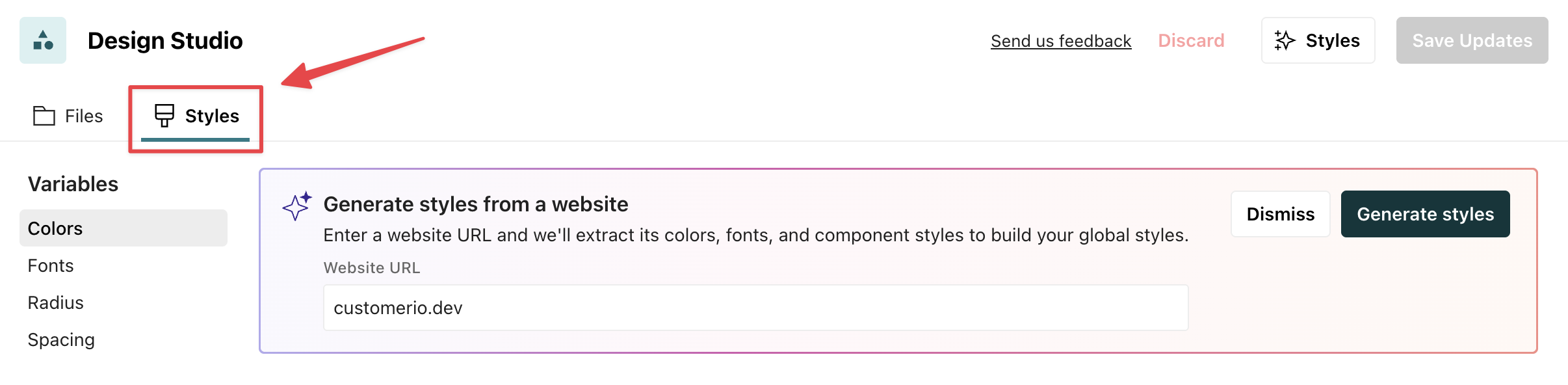
Generate styles with AI
Generate styles from your website using AI to quickly add your brand info. We analyze the sending domain for your workspace or a URL you provide, and then add styles to your variables and components for your review.
Save your changes
Generating styles adds onto the variables already saved to your workspace; it does not replace them. However, it may replace global component styling with the generated styles. Make sure you review the results before saving to ensure the results are what you want. The suggested styles are indicated with a sparkle icon .
We can generate styles even if your domain is unverified. If you have multiple sending domains, we’ll pull from the oldest one. You can find your domains in Workspace Settings > Email > Sending domains.
To generate styles with AI in Design Studio, go to the Styles tab on your dashboard:
- Click Styles and type in the website you’d like to pull from.
Your domain must load a webpage
If your domain does not load a webpage, we won’t be able to generate styles. You’ll have to manually enter them. - Click Generate styles. This process can take up to 2 minutes. You can navigate away and come back to see the results.
- Review the results. The suggested styles are indicated by . Are the variables accurate? Were components updated correctly? For instance, are buttons using a desired variable? Edit your variables and components as you see fit.
- Click Save updates.
If you’re not happy with the results, you can also refresh the page or click Discard.
Update & publish your global styles
You can update global styles from the Styles page or while editing an email.
From the email editor, you can save global styles across your Design Studio files, but will still need to publish them separately:
- Click and then select Global Styles.
- Make your change and click Save Updates. This saves across your messages in Design Studio, but does not push changes to connected campaigns, broadcasts, or transactional messages. You still have to manually publish your changes.
From Styles, you can save only or save AND publish changes across your messages and campaigns.
Delete a global style
If you delete a global font, color, radius, or spacing, it is no longer discoverable as a global style and no new messages will use the old styles.
If a deleted global variable was in use in your messages before you removed it, your existing messages continue to use the deleted style. The only difference you see is in the Properties menu. Where you used to see the name of the global style variable, you now see the value of the style. For instance, instead of the color variable “Primary-bg”, you’d see the hex value #e4ffce.