Legacy in-app editor
How it works
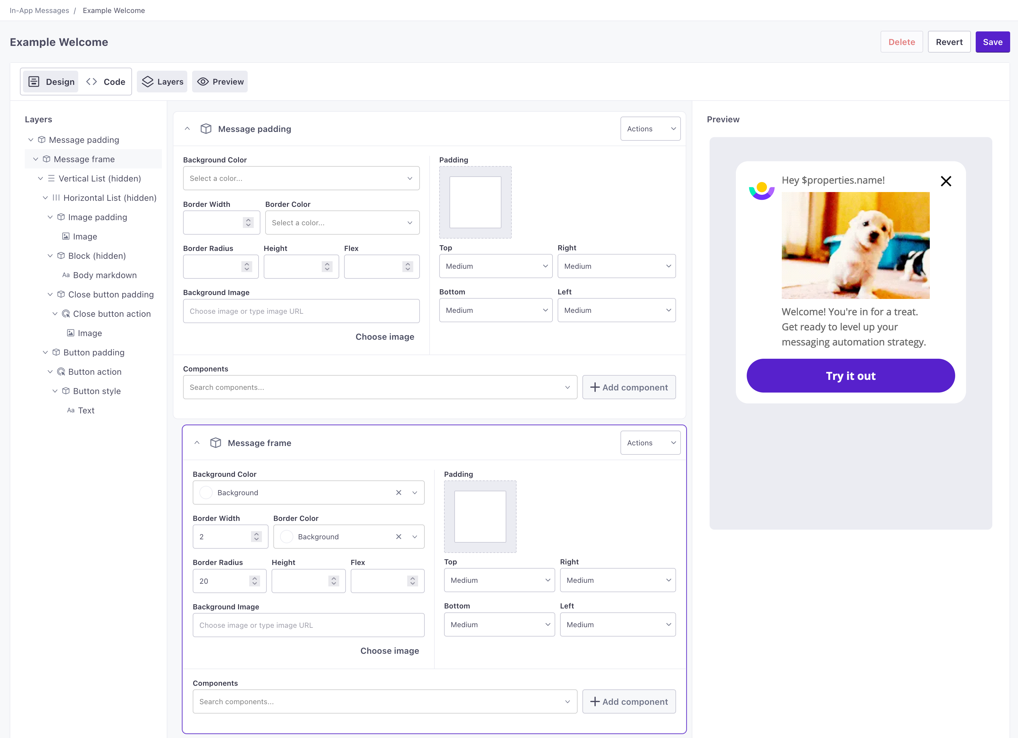
In-app message templates built in our older template editor include all of your message content, including the text areas you can customize when you create a message in Customer.io.
Any of the messages that you set up with this editor contain basic components like text and images, wrapped in actions that make them tappable. These items are then contained in blocks, lists, and grids that organize the layout of your message. For example, a button in your message that takes a person to a deep link is an action (deep link), containing a block (defining the shape of the button), containing a text component (button text).
Unlike messages you create with our new editor, messages built in this older editor also rely on in-app branding settings (fonts, colors, etc) that are only used in this editor.
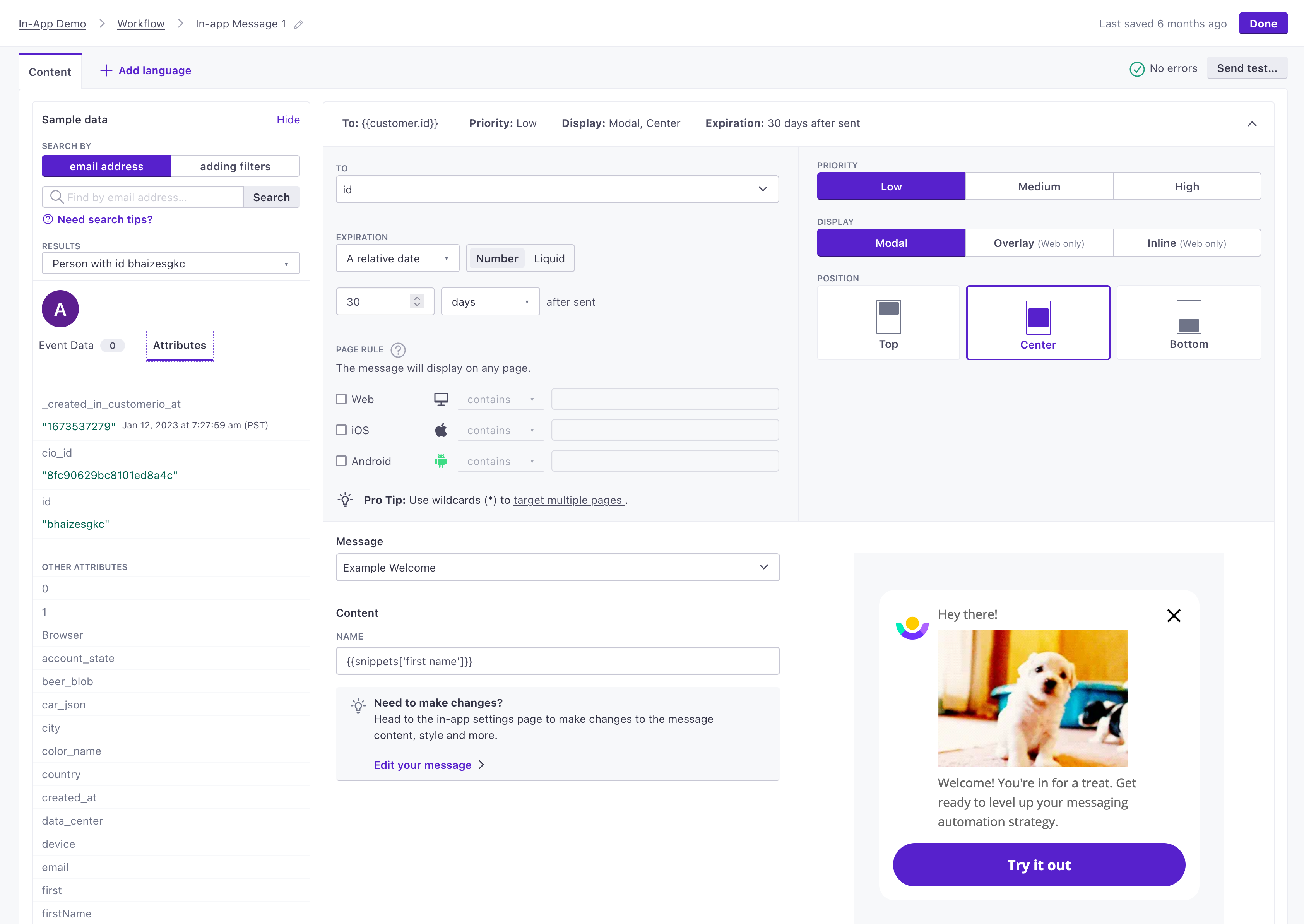
Create a message… | and use it in an automation |
|---|---|
 |  |
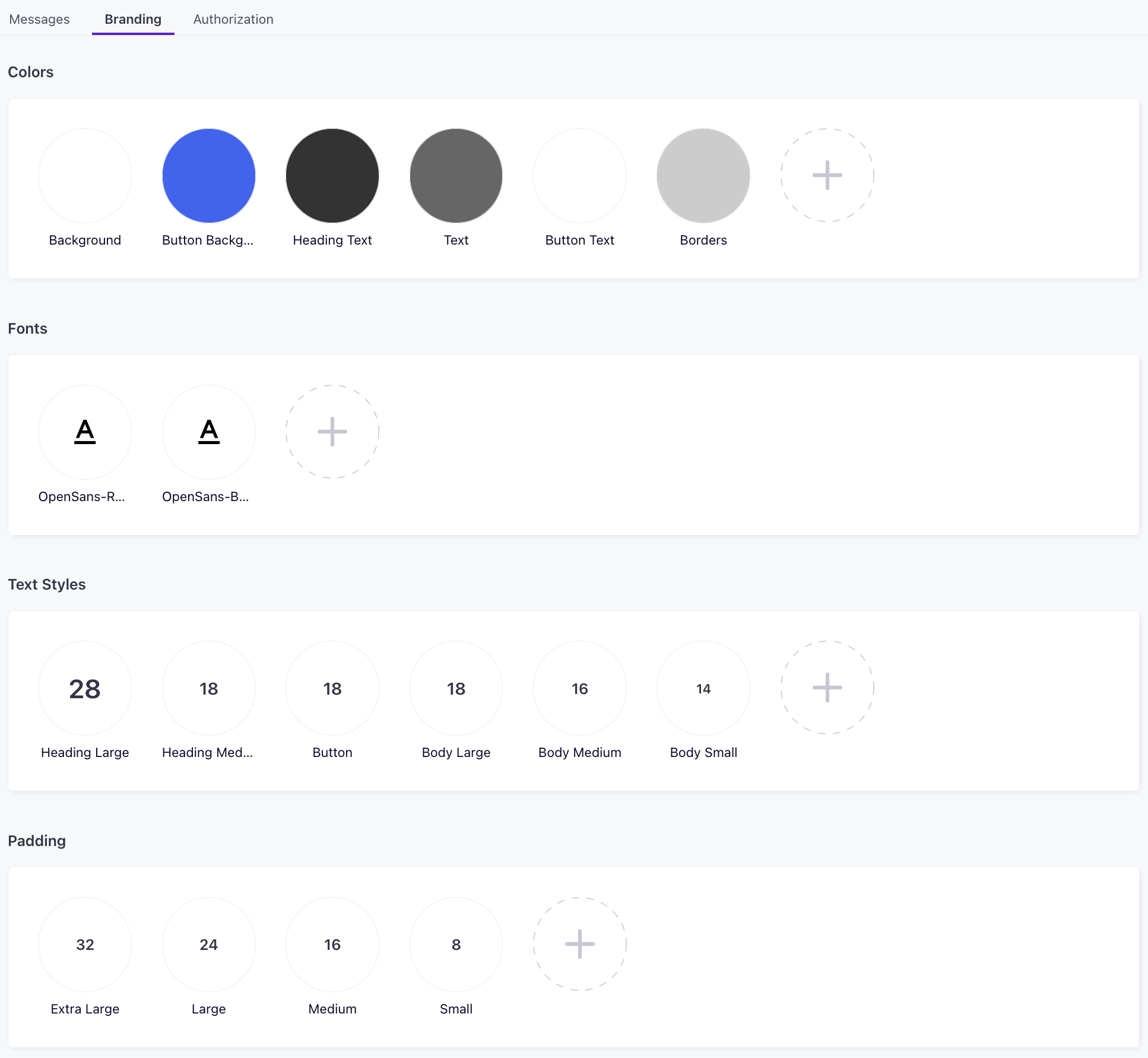
In-app branding
Branding rules determine the colors, fonts, and padding options used in the old template editor. They do not apply to messages you create in the block-based editor, which supports custom CSS classes and reusable styles.
Go to the Branding tab under Content > In-App Messages to set or change your in-app branding rules.
In-App message JSON
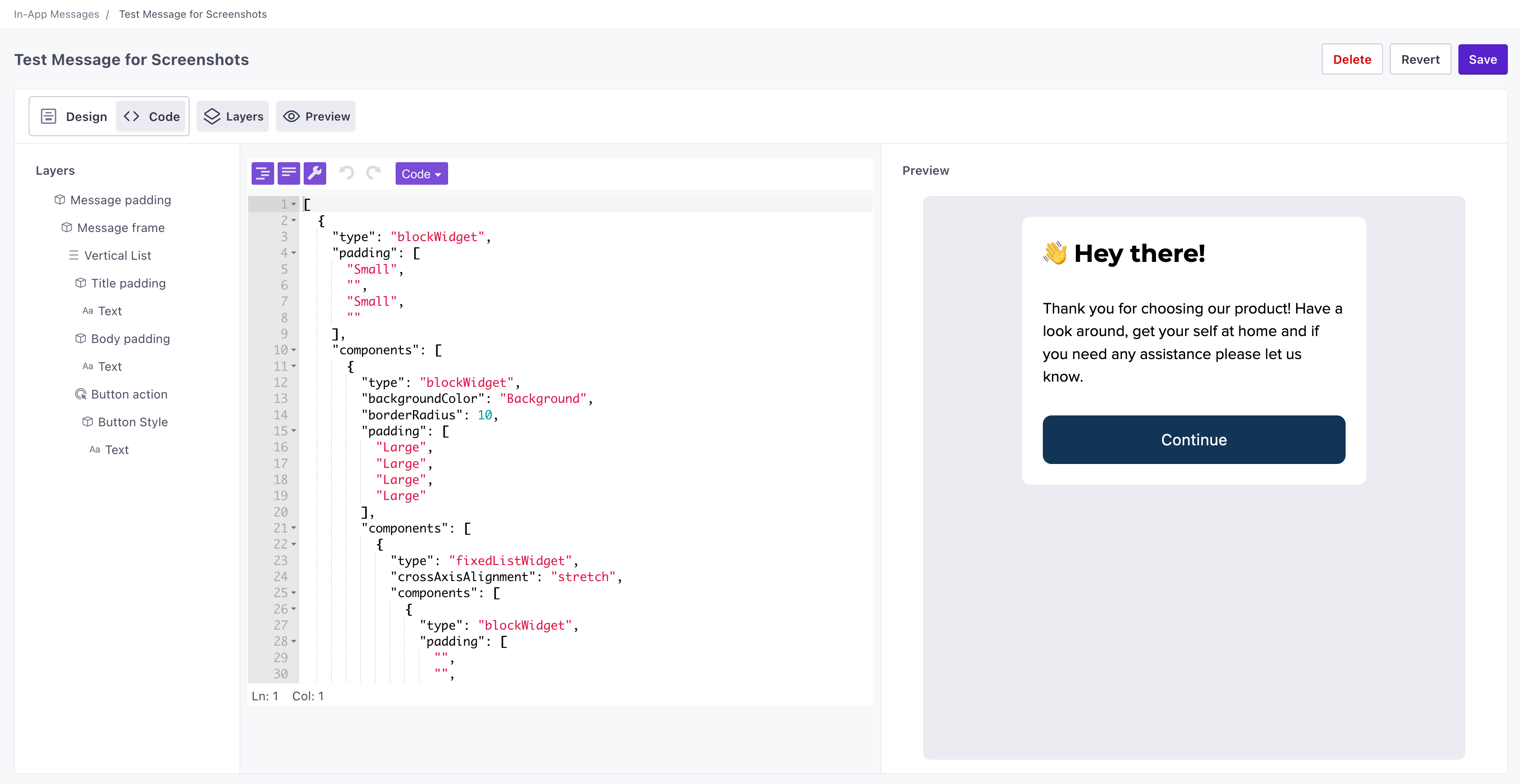
You can use the Show Code option to expose the JSON representation of your message.
Messages created in this editor are an array of objects, where each object represents a part of your message. Some items, like actions and blocks, contain nested components. You might use the code editor to rearrange your message by moving components in and out of blocks, or moving them up or down in the array.
Each component has a type and a gist object, both are required and set automatically by the editor.
typedetermines the type of widget you’re using in the editor—textWidget,imageWidget,actionWidget, etc.gistis an object containing a uniqueidfor the widget.
Edit an in-app message
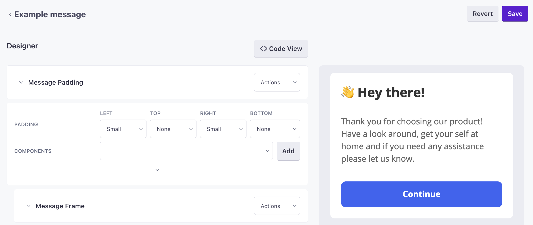
While we have a newer, easier to use editor, you might still want to edit messages that you created in our older in-app message editor. You can create new messages in this editor, but we strongly recommend that you use our new editor for new messages.
- Go to the Messages tab under Content > In-App Messages and select the message you want to edit.
- Add or move around components in your message. By default, a component only shows required fields.
- Use
$properties.<var>to add variables to your message that you can supply in Customer.io. For example,$properties.namecreates a field called Name in Customer.io - Click to reveal additional properties for the component.
- Click Actions in the upper-right of any component to change the order of components, wrap them in blocks, actions, etc.
- Use
As you create and update your message, we’ll show how it will appear in your app or on your website.
Customizing messages with variables
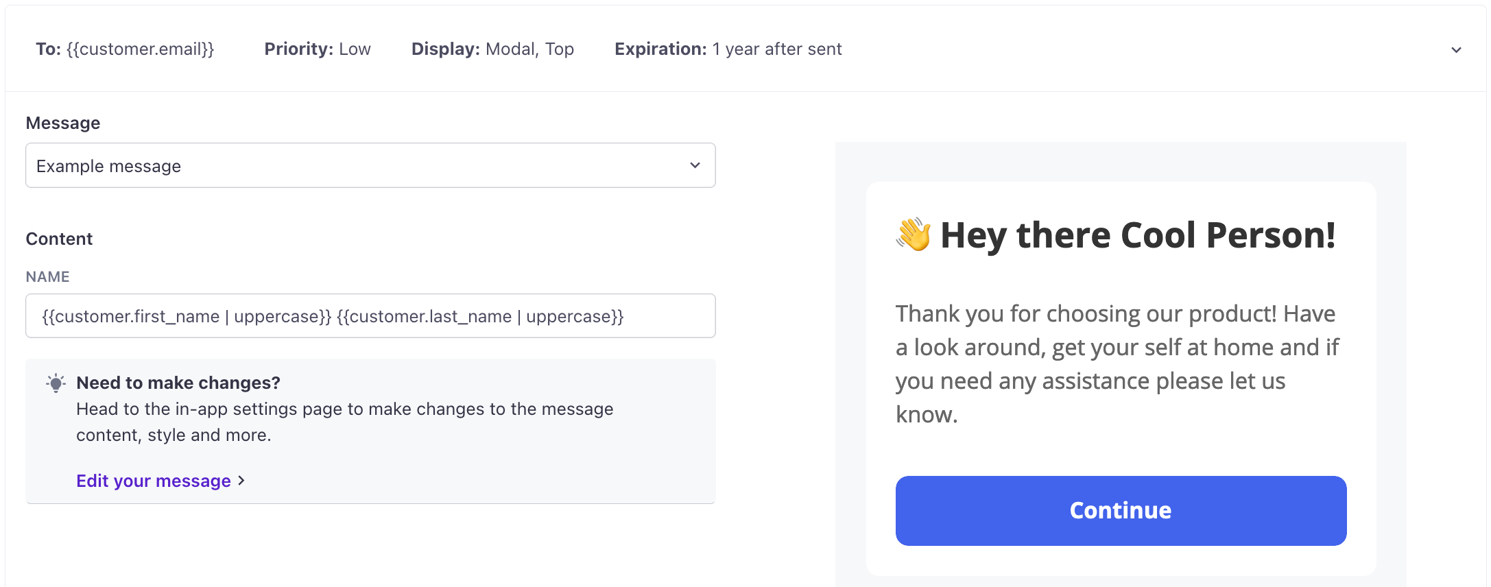
You can customize text in your message by adding $properties.<variableName> to text field. You can include as many variables as you like, and even simply set a variable name for an entire block if you want to give message creators control over the text that they send in messages. You can use the same variable multiple times if you want to duplicate variable text in your message.
When you create and populate your messages, you can use liquid A syntax that supports variables, letting you personalize messages for your audience. For example, if you want to reference a person's first name, you might use the variable {{customer.first_name}}.$properties.name to add a field called name when you use the message in an automation or broadcast.
Organizing your message
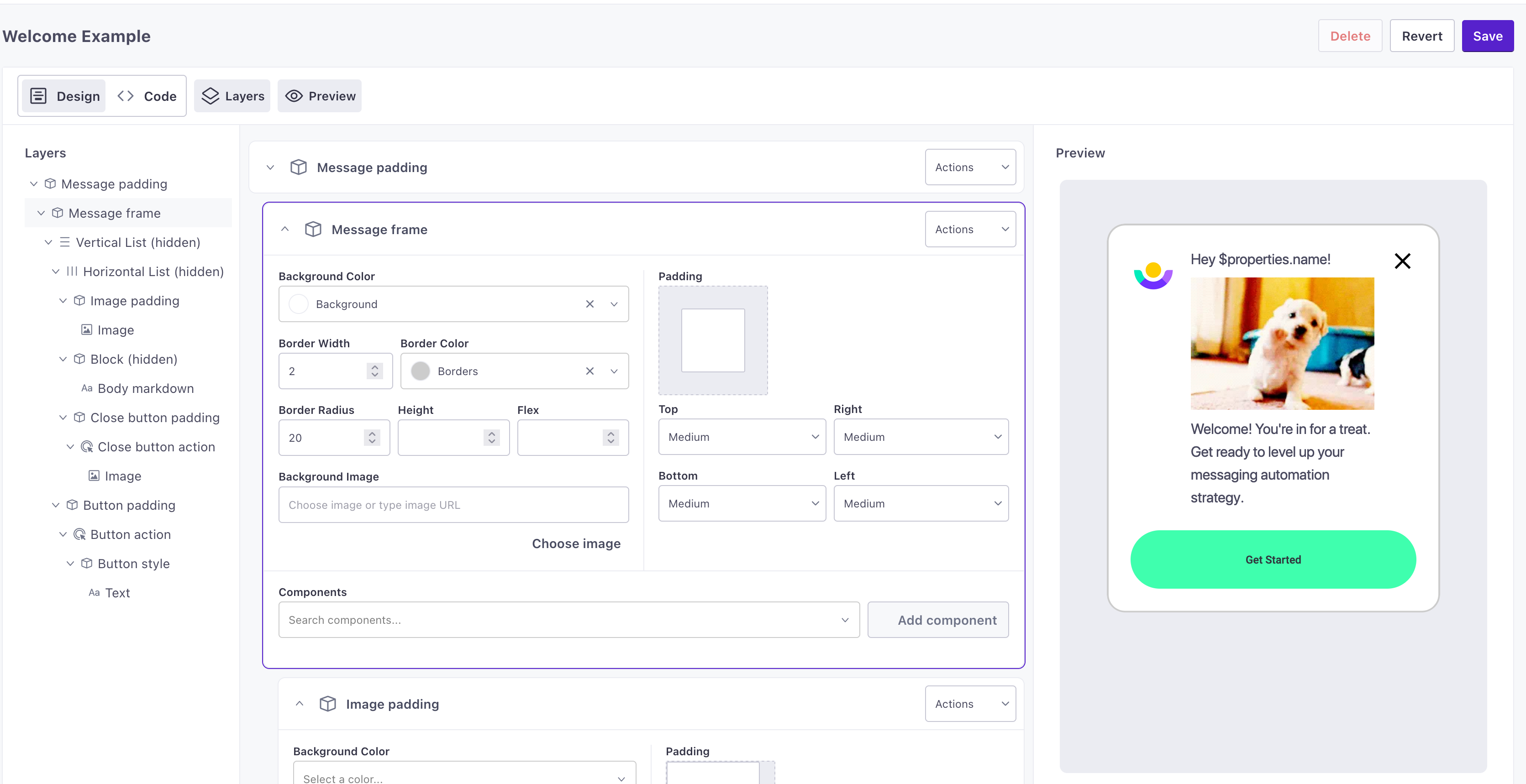
When you add a component or container, we show required settings by default. Click to show additional options.
We organize message items into blocks, content, and layout. In general, blocks make it easy to build your message with premade components, and the content and layout components give you more granular control to customize your message.
- blocks are premade groups of components that you can use to build your message.
- content are content components for your message, like text, images, etc.
- layout components help you organize the visible parts of your message horizontally, vertically, blocks that let you set padding, etc.
in-app messages are flexible: you can nest some containers inside each other. In this section, we’ll show a few common arrangements that you’ll use to create buttons, carousels, and so on.
Blocks
Message Frame
A message frame is a group of components you can use to establish an area with rounded corners. Nest content components within the frame as you see fit.
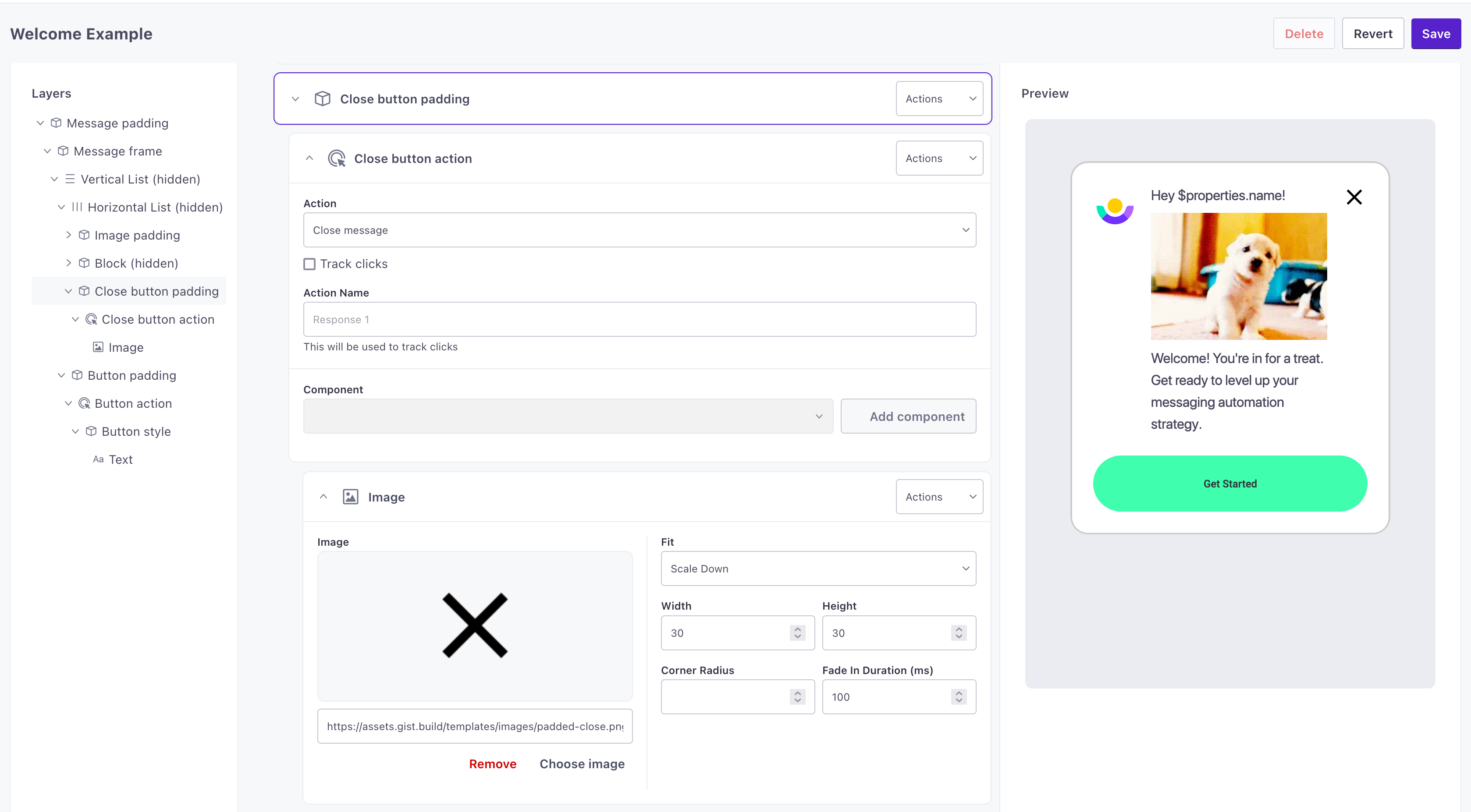
Close Button
A close button is a group of components you can use to do just that - close an in-app message. The action is automatically set to close the message, but you can also adjust the action and styling as you see fit.
Button
A button is a group of components you can use to add an actionable area to your message. The action is automatically set to close the message, but you can also adjust the action and styling as you see fit.
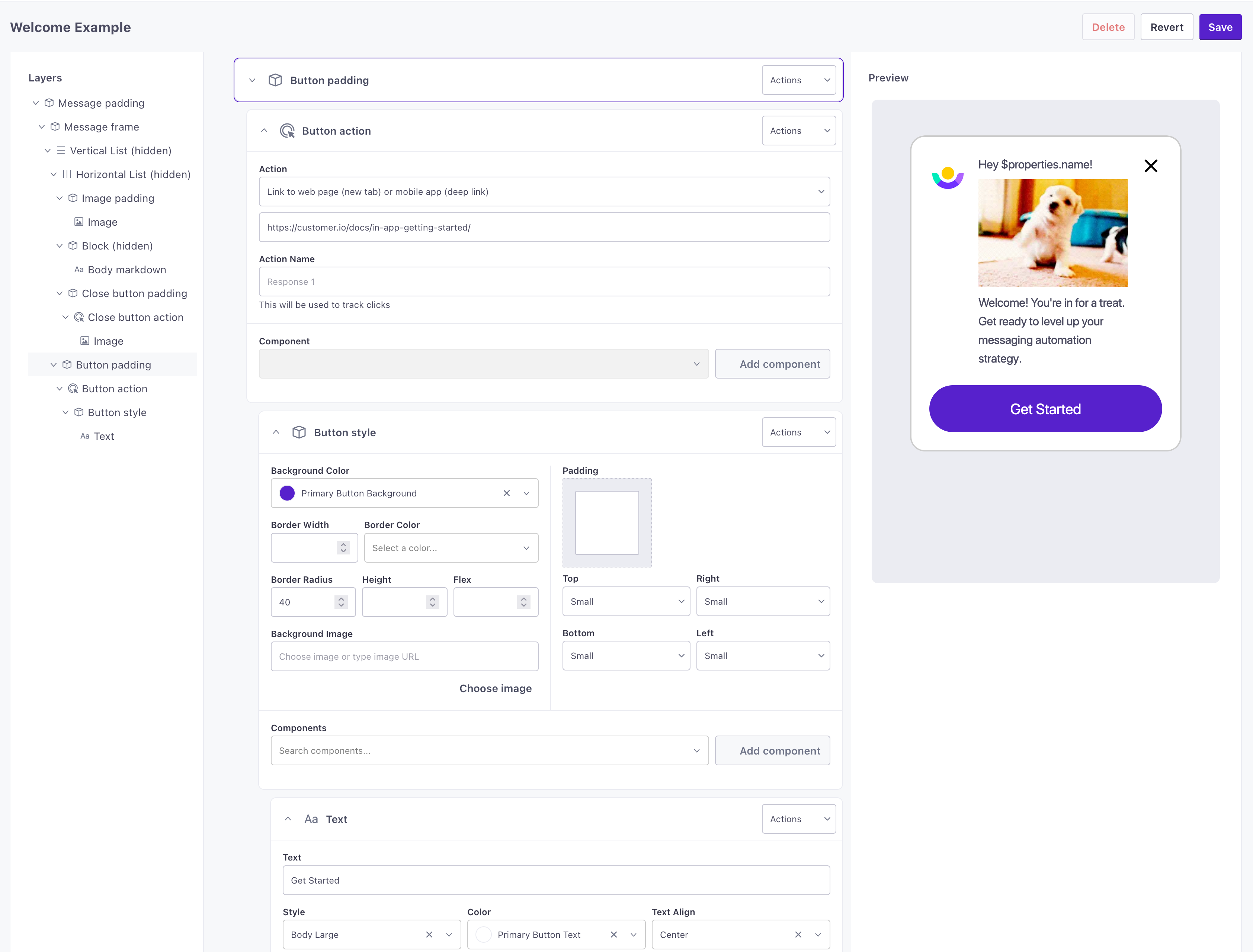
A button consists of four items, nested in this order:
- Button padding: a block that determines the padding around the outside of the tappable area.
- Button action: this determines what happens when someone taps the button.
- Button style: a block that defines the tappable area and controls the border color, the border radius/roundness of the button, and the color of the button.
- Text: the text for the button. You could substitute this for a different content component: icon, image or markdown for button text.
Click to style your blocks and content. You can modify the background color or center your button text, for instance.
Remember, if you want to personalize the text for your buttons when you create your message, use the syntax A syntax that supports variables, letting you personalize messages for your audience. For example, if you want to reference a person's first name, you might use the variable $properties.fieldname. When you create your message in Customer.io, you’ll see a fieldname that you can personalize with liquid{{customer.first_name}}.
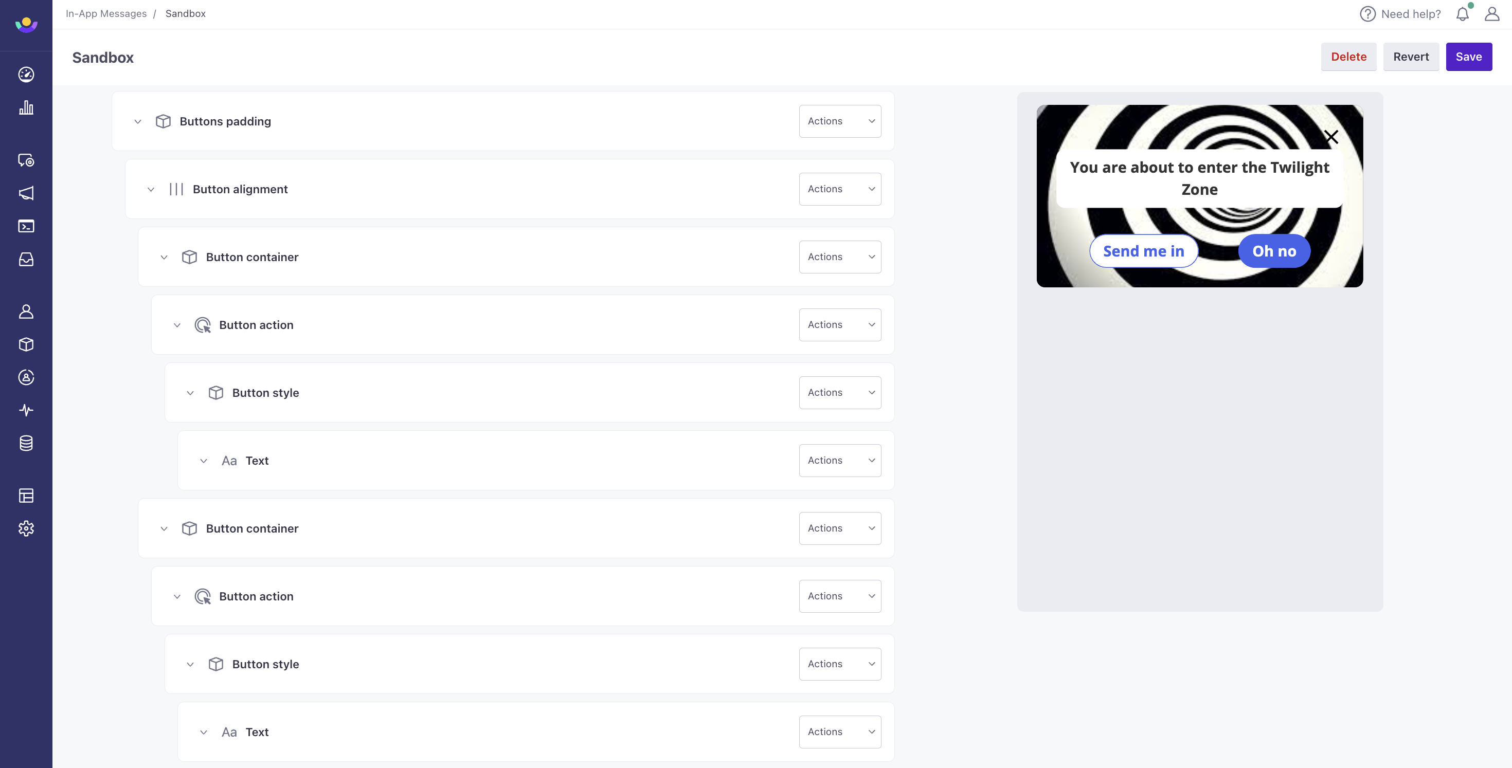
Two Button Row
A two button row is a group of components that places two buttons, side-by-side in the same row. Set the action, styling, and text as you see fit. You might use this to create an action button and a button that dismisses your message.
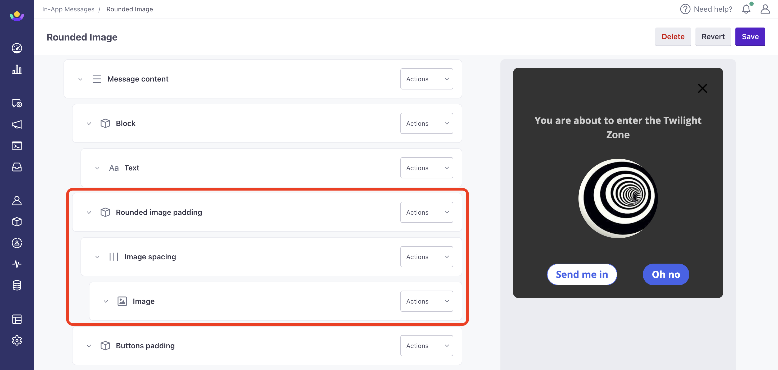
Rounded Image
A rounded image is a group of components that displays an image within a circular viewport. You can adjust the rounding through Corner Radius within the image component.
Surveys
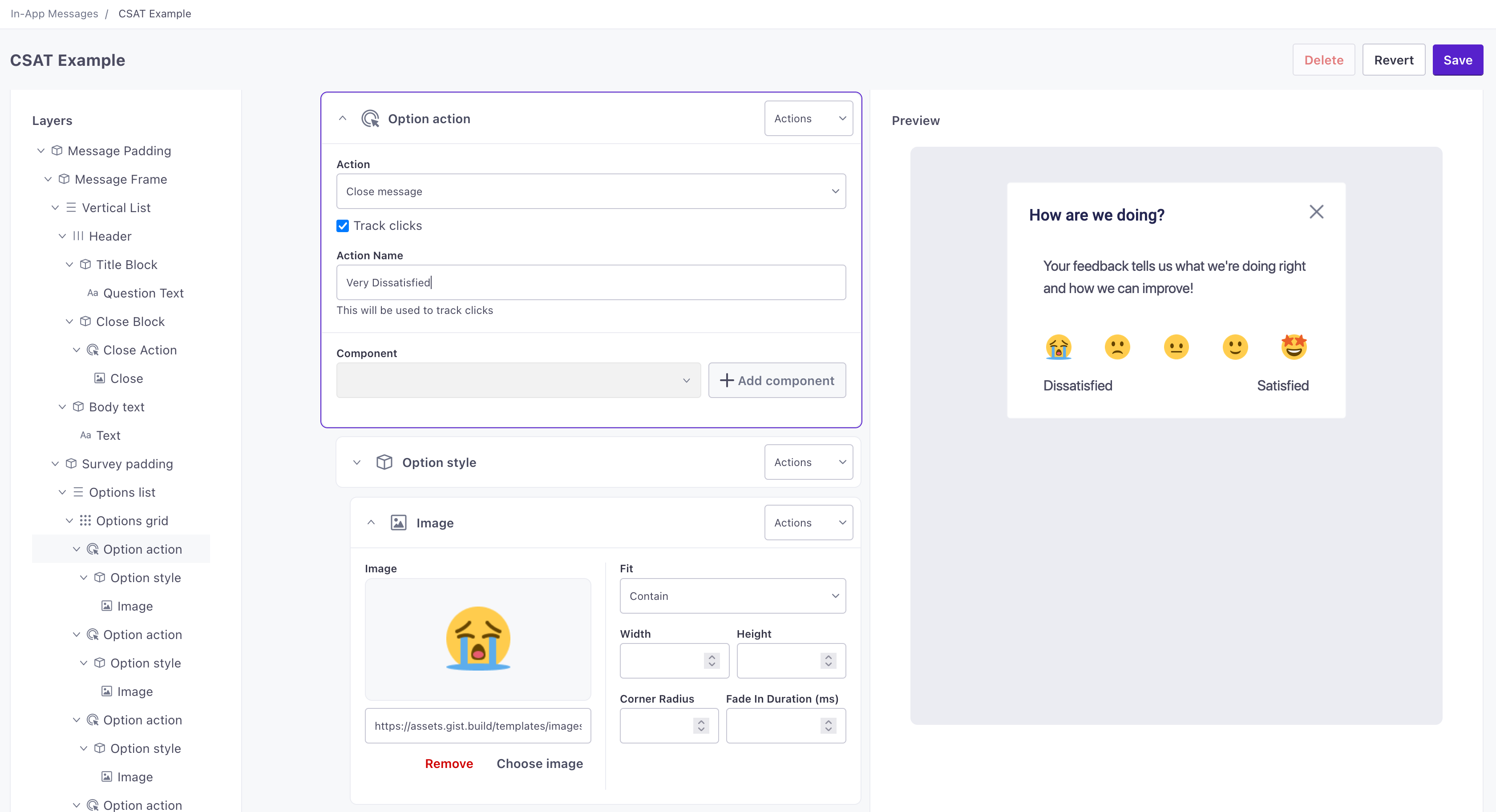
The Survey components make it easy to set up surveys for your recipients and automatically track responses in Customer.io. You can use these components to ask for feedback, ratings, or other information from your audience.
With these components, it’s easy to set up the options or ratings available to your audience. See microsurveys for more information about setting up surveys and tracking responses in Customer.io.
Links
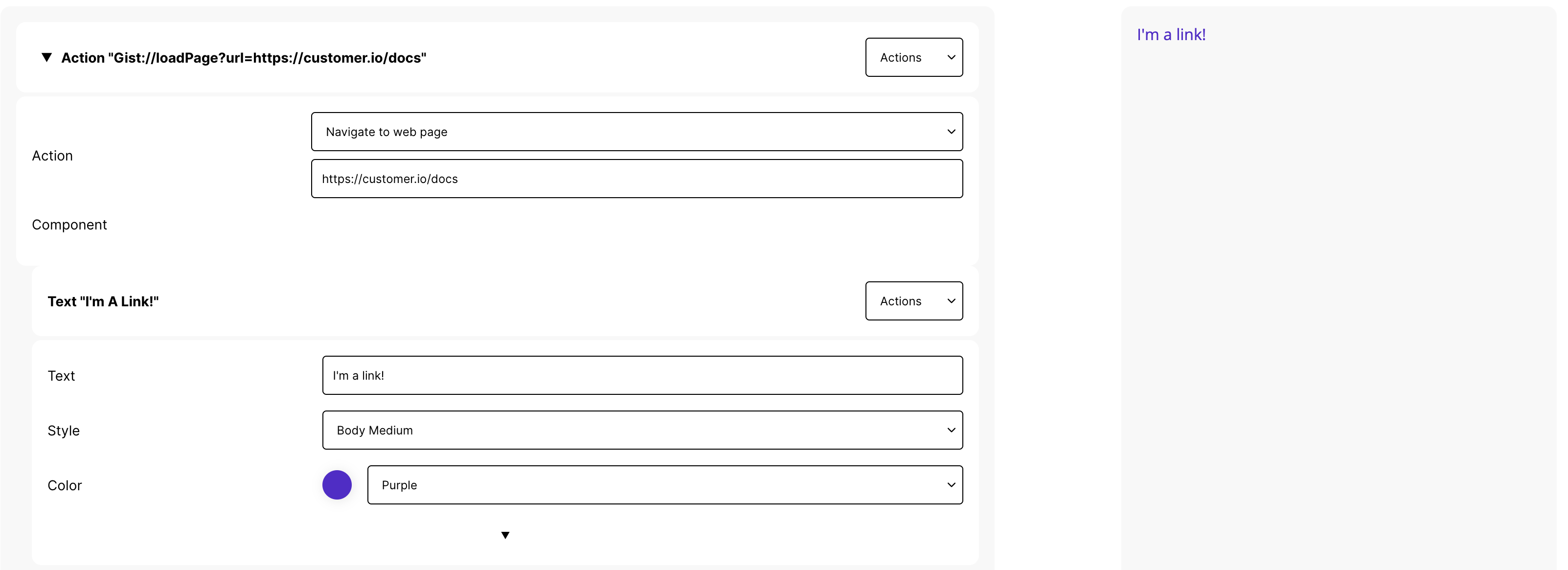
You can set up a link by adding an action component and then adding a text component inside the action. The action determines what happens when someone taps the text—whether the link goes to a website, somewhere in your app, a mail application, etc.
Content
Text
A text component represents any text in your message—headings, body, footers, etc. Use $properties.<variableName> to add a customizable variable to your message. When someone uses your message in an automation or broadcast workflow, they’ll see a field called <variableName> that they can personalize for your audience.
Press to expose options to style your text.
JSON
{
	"type": "textWidget",
	"text": "$properties.name",
	"style": "bodyText",
	"color": "black",
	"textAlign": "left",
	"maxLines": 1,
	"overflow": "ellipsis"
}
Schema
- textstringrequiredThe text you want to display.
- typestringrequiredDefines the widget type.Accepted values:
textWidget - colorstringThe color you want to use for this content. You can only set values here that are defined under Content > In-App Messages.
- maxLinesintegerThe maximum lines of text you want to display. Text over this limit is controlled by the
overflowproperty. If unset, the message displays an unlimited number of lines. - overflowstringDetermines how to handle text that overflows the
maxLineslimit (if set). By default, we cut off overflowing text with ellipsis (...).Accepted values:ellipsis,fade,clip - stylestringThe style of text you want to display. You can only set values here that are defined under Content > In-App Messages.
- textAlignstringHow you want to align this text.Accepted values:
center,right,left,start,end,justify
Markdown
You can use the markdown component to style text using markdown syntax.
| Markdown |
|---|
| # Heading 1 |
| ## Heading 2 |
| ### Heading 3 |
| bold |
| bold |
code |
| text |
| 1. go to concert 2. scream-sing your favorite song 3. return home overjoyed and exhausted |
|
To render markdown using your branding settings, select the styles for headings, text and links below the markdown field. Begin by specifying the color so that they appear on the canvas.
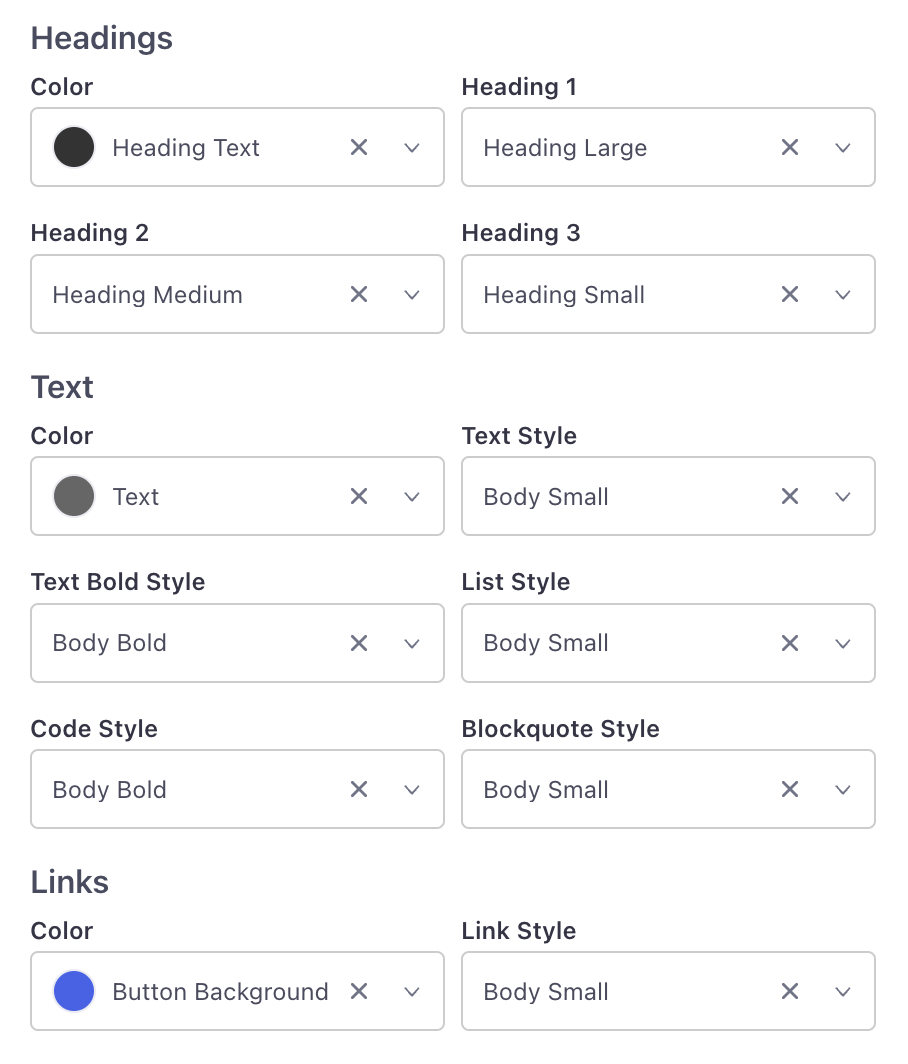
Check the preview on the right to see if you’ve chosen your desired fonts and colors.
Image
Upload an image for your message. Click the downarrow to reveal additional properties determining the width of your image, how it should fit the bounds of the message, whether it should fade in, etc.
JSON
{
	"type": "imageWidget",
	"image": "$properties.imageUrl",
	"fit": "cover",
	"height": 50,
	"width": 50,
	"cornerRadius": 25,
	"fadeInDuration": 200
}
schema
- imageobjectrequiredThe URL of the image that you want ot use in your message.
- typestringrequiredDefines the widget type.Accepted values:
imageWidget - cornerRadiusintegerSets the radius of corners for an item in pixels, similar to the
border-radiusCSS property. - fadeInDurationintegerThe durration for the image to fade in, in milliseconds, similar to the
fadeInCSS transition property. - fitstringDetermines how the image fits your message. Defaults to
cover.Accepted values:none,fitWidth,cover,contain,scaleDown,fill,fitHeight - heightintegerThe height of the component in pixels, if you want to constrain it. If you don't set a height or width, we'll scale your content to fit your message or container.
- widthintegerThe width of the component in pixels, if you want to constrain it. If you don't set a height or width, we'll scale your content to fit your message or container.
Icon
The Icon widget displays an icon from an icon font. You must load fonts in the assets section of your app configuration to show icon fonts.
JSON
{
	"type": "IconWidget",
	"color": "black",
	"font": "IconFont-One",
	"size": 18,
	"value": "\e012"
}
schema
- colorstringrequiredThe color you want to use for this content. You can only set values here that are defined under Content > In-App Messages.
- typestringrequiredDefines the widget type.Accepted values:
iconWidget - valuestringrequiredThe value of the icon that you want to use. For example, for font-awesome, you'd use the name of the icon.
- fontobjectThe icon font you want to use.
- sizeintegerThe pixel size of the icon.
Action
An Action determines what happens when someone taps one or more components in your message. You might use an action to send someone to a link in your app, an external link, etc. When you add an action, you’ll determine the action and then add components inside the action.
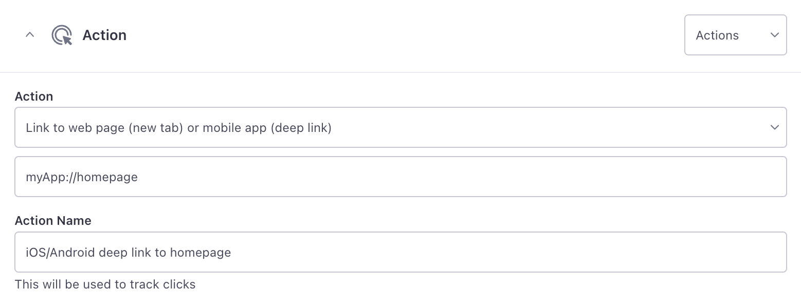
We support the following actions:
- Close message: Dismisses the in-app message.
- Link to web page: Sends the message recipient to a web page in their default browser.
- Link to web page (new tab) or mobile app (deep link): Sends a person to a deep link in your app or a webpage (if you use Universal Links). You’ll need to know the deep link format and screen you want to send a person to.
- Show another message: Change the content of your message when someone interacts with it.
- Custom action: Set up an action handled directly by your app. See the section below for more information.
If you use the Show Code option, the action is the link. You can set a behavior key determining how to handle the action. See the schema below for available values.
JSON
{
	"type": "actionWidget",
	"action": "myApp://homepage",
	"behaviour": "push",
	"component": {}
}
schema
- actionstringrequiredThe link or place you want to send a person. This is either a deep link in your app, a web address, a
mailtolink, or a way to close the message (gist://close). - componentobjectrequiredThe component a person taps to perform the action defined in this widget.
- typestringrequiredDefines the widget type.Accepted values:
actionWidget - behaviourstringAction behavior;
pushadds a route,systemdelegates to the OS,backpops one route, andretainreplaces the current view.Accepted values:push,system,back,retain
Track Clicks
The Track Clicks box tells Customer.io to track when someone taps the action—similar to the way tracked links work in emails. This setting is enabled by default. If you disable this setting, we won’t track when someone taps the action.
Tracked responses are based on the action name, so make sure that you give your actions names that will make sense to you when you look at metrics later.
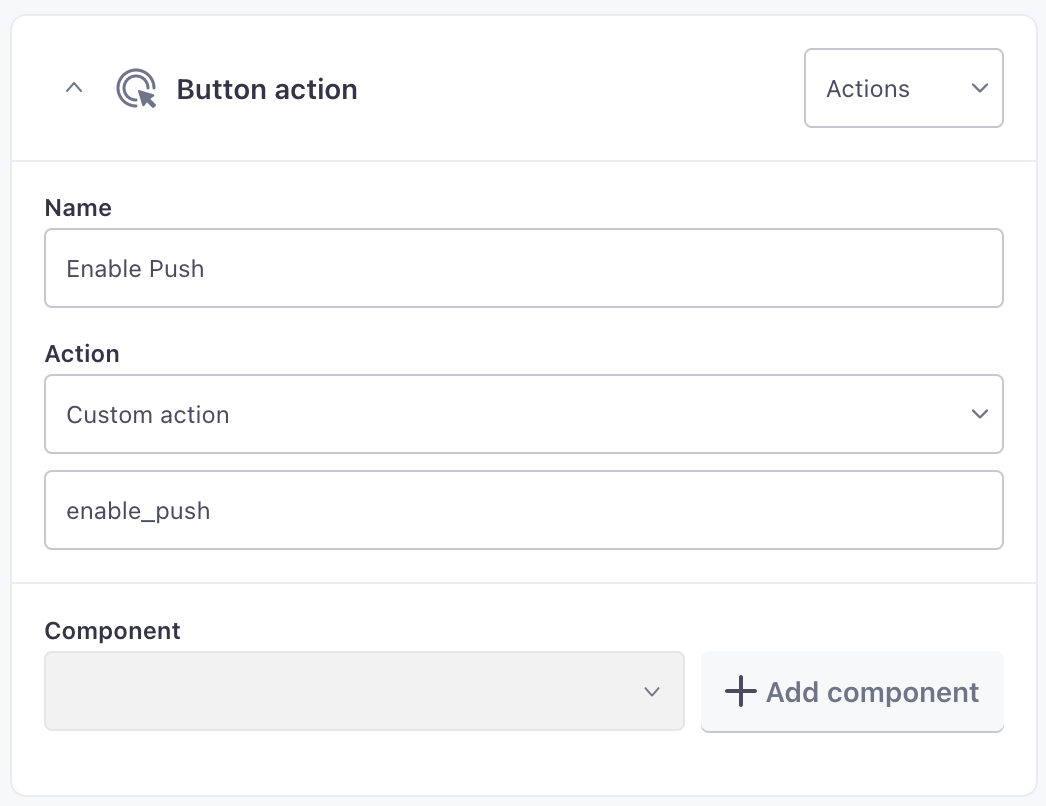
Custom actions
Unlike other actions, which do something predefined by our SDKs, you can also set up “Custom Actions”—this is custom code that you want to execute when someone interacts with your message. For example, if you send an in-app message requesting that your audience opts-into push notifications, you might execute custom code to trigger the operating system’s native opt-in prompt. Custom actions give you the flexibility to handle your audience’s responses to messages in ways that fit your app uniquely.
Our SDKs expose an in-app event listener called messageActionTaken. You’ll set up your app to listen for this event and the custom actionName or actionValue that you set. When it occurs, you’ll execute custom code in your app. See the in-app pages for our SDKs to learn more about in-app event listeners and set up your first custom action.
Dismissing messages with custom actions
All of our SDKs expose methods to listen for the actions people take when they interact with your messages and methods to dismiss the message. If you use custom actions, you’ll need to make sure that your app or website does the following things to execute custom actions and dismiss messages appropriately:
- Listen for the custom action (either by
event.actionNameorevent.actionValue). - Perform your custom action—this is your own code.
- Use the
dismissMessagemethod to stop showing the message to your audience. See relevant documentation for our SDKs for more information about event listeners and dismissing messages.
Carousel
A carousel is content that users can swipe without dismissing your message. You might use a carousel to showcase new features, provide a tutorial, etc.
You’ll use a Fixed horizontal scroll widget containing at least two components. You can even wrap items in the carousel in actions, so that each item in your carousel performs a different action.
Layout
Block
A block is a group of components that you apply a design to. You might group components to set a background image, apply rounded corners, etc. The only required property is the list of components you want to nest inside the block.
JSON
{
	"type": "blockWidget",
	"safeInsets": false,
	"padding": ["m","m","m",""],
	"backgroundColor": "white",
	"borderColor": "black",
	"borderWidth": 1,
	"borderRadius": 10,
	"height": 150,
	"backgroundImage": "$properties.backgroundImage",
	"flex": 1,
	"components": []
}
schema
- backgroundColorstringThe background color for your block. You must set a value defined under Branding > Colors.
- backgroundImagestringSet a background image for the block
- borderColorstringThe border color for your block, if you set a border width greater than 0. You must set a value defined under Branding > Colors.
- borderRadiusintegerSets the radius of corners for an item in pixels, similar to the
border-radiusCSS property. - borderWidthintegerThe width of the border for this block in pixels.
- componentsarray of [ objects ]An array of child components that you want to make available inside this widget.
- flexintegerThe single digit syntax for the CSS
flexproperty. The value you use here determines the propotional amount of space the block consumes in a parent container. - heightintegerThe height of the component in pixels, if you want to constrain it. If you don't set a height or width, we'll scale your content to fit your message or container.
- paddingarray of [ strings ]Defines padding for the block, based on the values set under Branding > Padding. As with the CSS
paddingproperty, values in the array represent top, right, bottom, and left padding. - safeInsetsbooleanDefault:
falseBased on the envsafe-area-inset-*CSS properties. Set to true to ensure that the block can't overflow the defined screen or the defined area of your message. Defaults tofalse. - typestringDefines the widget type.Accepted values:
blockWidget
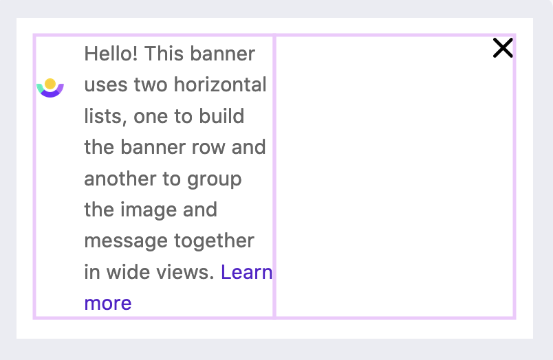
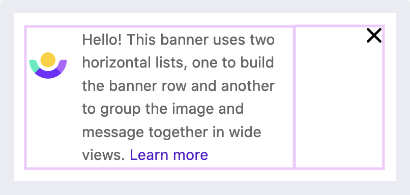
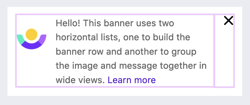
The Flex property
The flex property is an integer that defines the proportion of two or more blocks in a horizontal list. Using a banner example, we can show the same banner with three different pairs of flex values.
1:1
3:1
9:1
Horizontal List
A horizontal list lays out components horizontally, letting you set the alignment of the items in the list. Nest content components within this layout to horizontally align them. Wrap these components in blocks for additional styling. The flex property of blocks can help you establish the ratio of space between each block in a horizontal list.
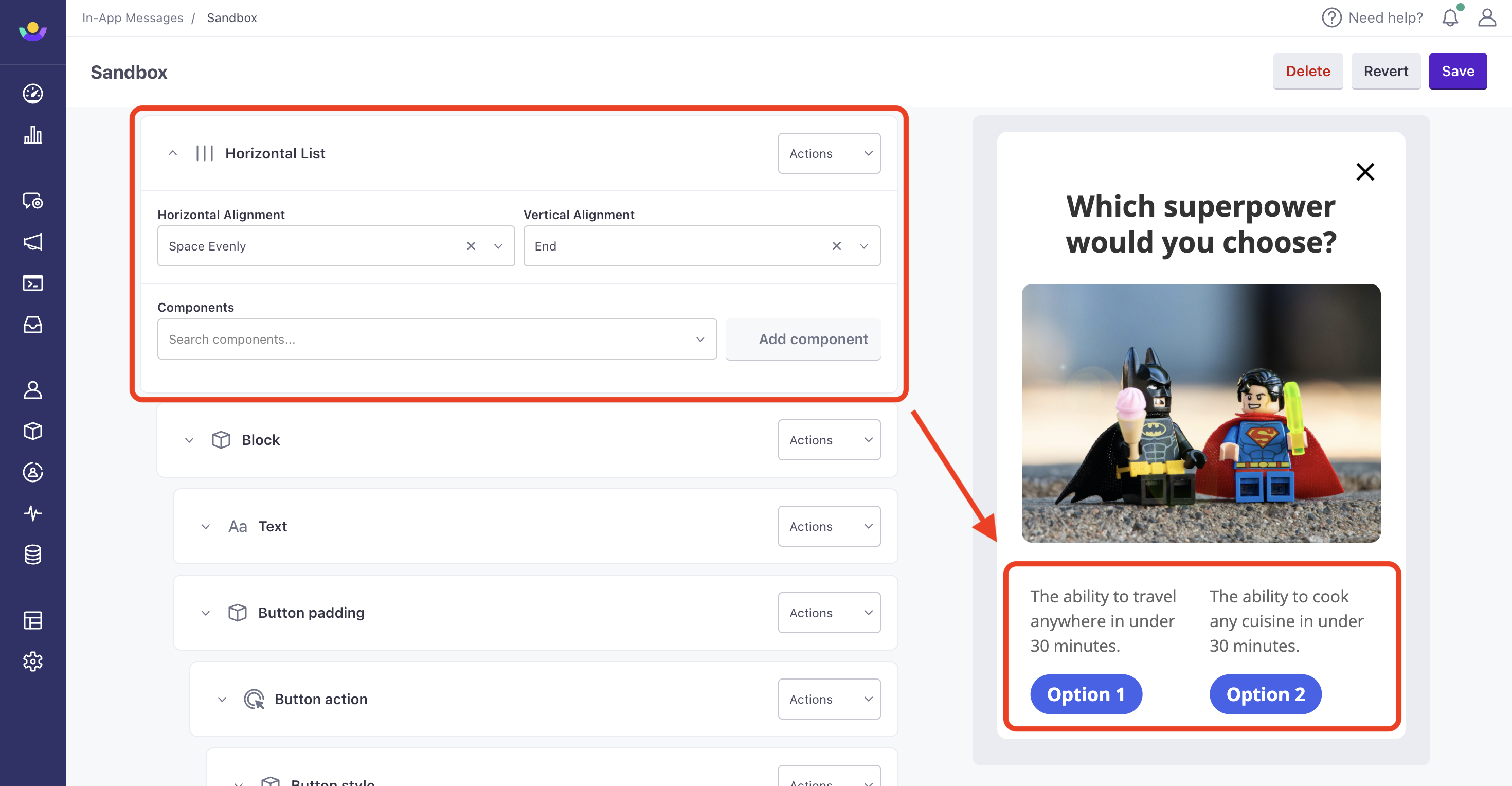
JSON
{
	"type": "fixedHorizontalListWidget",
	"mainAxisAlignment": "start",
	"crossAxisAlignment": "center",
	"components": [{},{}]
}
schema
- componentsarray of [ objects ]An array of child components that you want to make available inside this widget.
- crossAxisAlignmentstringThe crossAxisAlignment property supports the following optionsAccepted values:
center,start,end,center,stretch,baseline - mainAxisAlignmentstringThe mainAxisAlignment property supports the following options.Accepted values:
start,end,spaceBetween,spaceAround,spaceEvenly - typestringDefines the widget type.Accepted values:
fixedHorizontalListWidget
Vertical List
While components in your message are typically displayed top-to-bottom, a vertical list helps you align these items. You can set up vertical lists to control the vertical layout of your message.
JSON
{
	"type": "fixedListWidget",
	"mainAxisAlignment": "start",
	"crossAxisAlignment": "center",
	"components": [{},{}]
}
schema
- componentsarray of [ objects ]An array of child components that you want to make available inside this widget.
- crossAxisAlignmentstringThe crossAxisAlignment property supports the following optionsAccepted values:
center,start,end,center,stretch,baseline - mainAxisAlignmentstringThe mainAxisAlignment property supports the following options.Accepted values:
start,end,spaceBetween,spaceAround,spaceEvenly - typeobjectDefines the widget type.Accepted values:
fixedListWidget
Carousel
A carousel is a list of items you can scroll hortizontally. One component displays at a time, and users can swipe left to right to see different components. A carousel takes up the entire width of the parent list, block, or grid.
JSON
{
	"type": "fixedHorizontalListScrollWidget",
	"height": 150,
	"components": [{},{}]
}
schema
- componentsarray of [ objects ]An array of child components that you want to make available inside this widget.
- heightintegerThe height of the widget in pixels.
- typestringDefines the widget typeAccepted values:
fixedHorizontalListScrollWidget
Grid
A grid is like a horizontal list, except that you can control the padding between elements and the aspect ratio of items in the grid. This allows you to customize your layout with tall, skinny grids or short, long grids. By default, a grid’s aspect ratio is 1.0.
JSON
{
	"type": "fixedGridWidget",
	"itemPadding": "xs",
	"columns": 2,
	"childAspectRatio": 1.5,
	"components": [{},{}]
}
schema
- columnsintegerrequiredThe number of columns in your grid.
- componentsarray of [ objects ]requiredAn array of child components that you want to make available inside this widget.
- typestringrequiredDefines the widget type.Accepted values:
fixedGridWidget - childAspectRationumberThe aspect ratio for items in the grid. Defaults to 1.0
- itemPaddingstringThe padding between items in your grid.
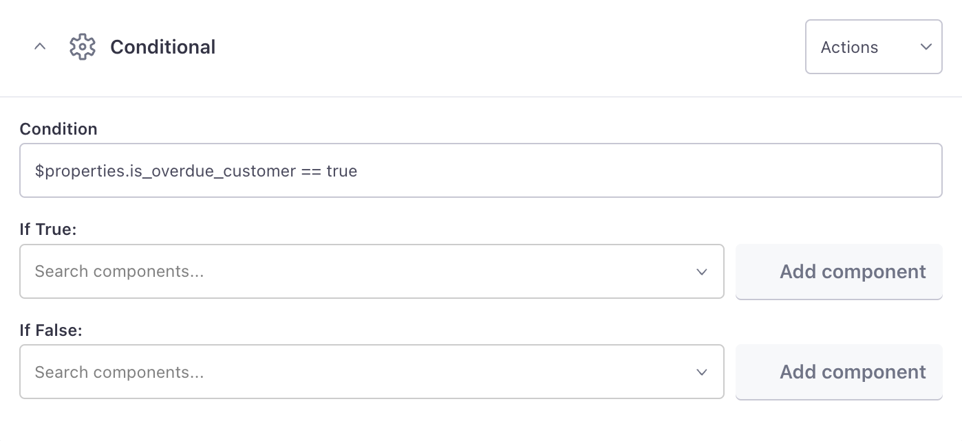
Conditional
Use a conditional to show or hide parts of your message based on a true/false condition.
There are three fields to complete when using a conditional component:
- Condition: The function that you want to evaluate as “true” or “false”. The condition field supports: >, <, == & in. If you don’t specify an operator, the condition will check if the property is null.
- If True: The components that you want to display when the condition is true.
- If False: The components that you want to display when the condition is false.
When building your message, entering 1 == 1 is an easy way to force the condition to true and 1 == 0 will force it to false. When you’re set with the design, replace the condition with $properties.condition_field == MATCH-VALUE. This adds a field called Condition Field to your in-app messages which you can then configure with static or dynamic values from the automation or broadcast. If the value matches, the True section will show to the recipient. Otherwise, the False section will show.