

Global styles for in-app messages
In Design Studio, you can define colors, fonts, and more in Global Styles to reuse them across your messages. This way, you spend less time adding the same branding to each message. Global styles apply to emails made in Design Studio and in-app messages.
How Design Studio works
Design Studio is a flexible editor that helps you create beautiful, responsive messages faster than ever before. Use it to set branding across emails made in Design Studio and in-app messages.
If you’re new to Design Studio, this is the core of what you need to know:
- You continue to create an in-app message in a workflow, like an automation or broadcast. By default, new messages use the styles set in Design Studio.
- You create global styles in Design Studio > Styles.
- Set global style variables (your colors, fonts, radii, and spacing).
- Then assign them to standard components, like paragraphs and headings, so each part of a message uses the right branding.
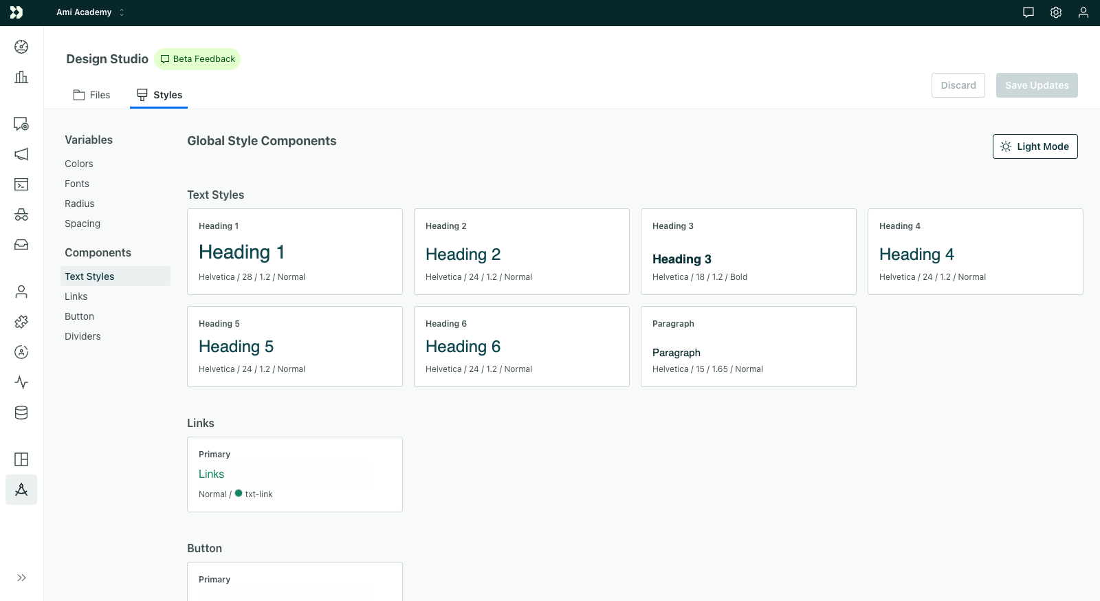
- When you update global styles, you decide whether to “Save only” or “Save and publish”.
- Choose “Save only” if you don’t want workflows (your automations, broadcasts, etc) to use the latest styles.
- Choose “Save and publish” if you’re ready to update messages in your workflows (and start sending messages with the latest styles).
Go to Design Studio’s page on Global Styles for more information:
- How to set global style variables
- How to set default branding for components
- How to publish styles to emails & in-app messages
Get started
In-app messages use global styles set in Design Studio. The variables you assign to components are the defaults for in-app messages.
If you’re creating an in-app message from scratch, it will automatically pull in your global styles. For existing messages, you can choose to sync global styles from Design Studio.
Exceptions for in-app messages
In-app messages work a little different from emails, so here are a few notes on which settings apply to in-app:
- By default, in-app messages use the same styles in light and dark mode. You can set separate dark mode values for color properties—like fills, text, and borders—in global styles or in an individual message. Where you don’t set a dark value, the light value applies in both modes.
- Your JavaScript web integration has to report the recipient’s color scheme. While the iOS and Android SDKs automatically follow the device appearance by default, your website’s JavaScript integration has to set
colorScheme: "auto". Without this, messages keep their light styles. - In-app messages and emails have the same breakpoint: 600px wide. Both pull in desktop and mobile styles based on the recipient’s screen size. With modal in-app messages, the breakpoint continues to be 600px wide; however, it’s based on the message width, not the screen width. For instance, if a modal message is 300px wide, but the screen width is 800px, the modal message will display the mobile version of the styles.
- The single button component automatically use global styles. However, the components built from multiple buttons do not automatically use global styles; you have to reset the properties to pull in your branding.
Set light and dark mode styles
By default, in-app messages use the same styles in light and dark mode. You can set separate dark mode values for color properties—like Fill, Text color, borders, and divider colors. Anywhere you don’t set a dark value, the light value applies in both modes.
On any property that supports dark mode:
- Click to expose separate light and dark mode values.
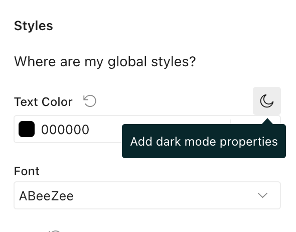
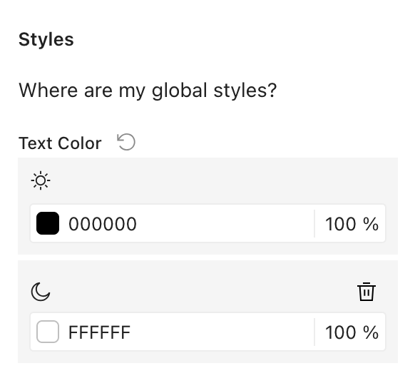
- Set light and dark mode values.
- At the top of the canvas, click to switch the canvas between the light and dark previews.
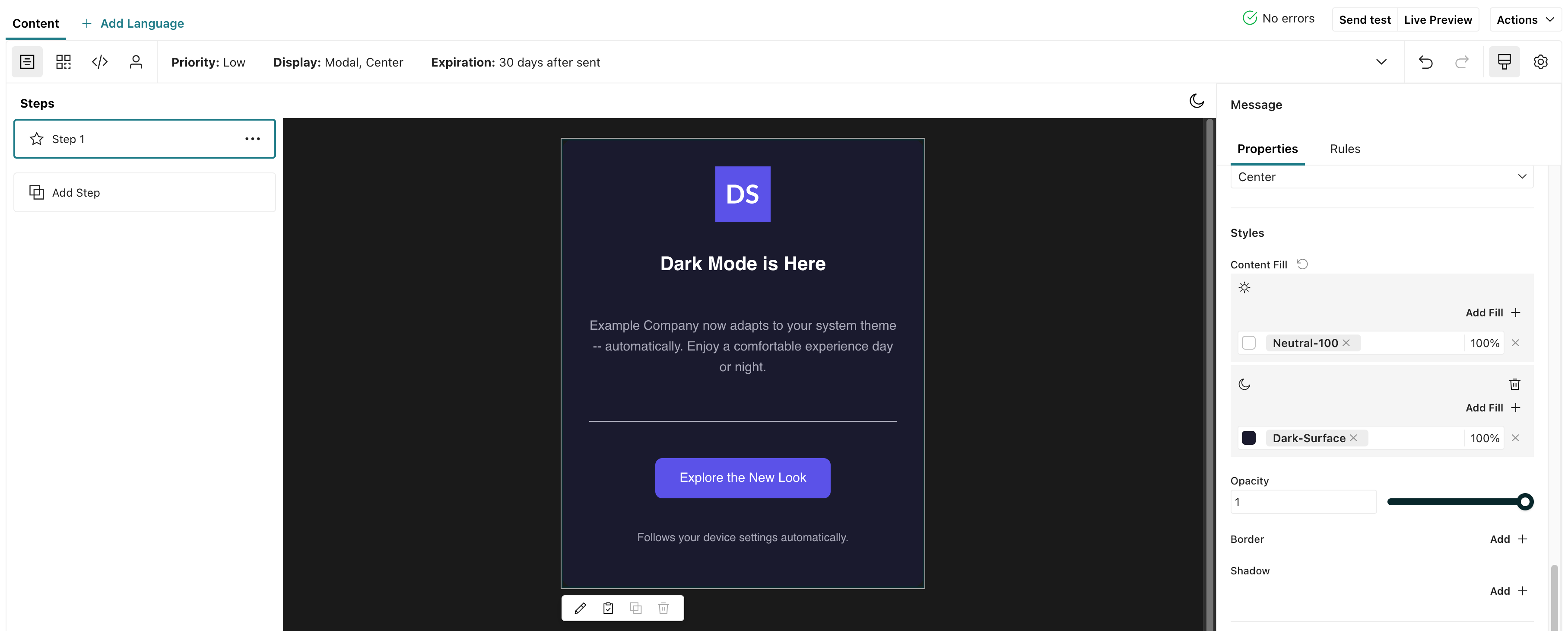
You can override your global styles on any message as well. You might do this if your normal light and dark mode styles don’t work well with a particular message or a page where you show a specific message. See Set light and dark mode styles when you build a message.
Sync global styles to in-app messages
Any message made before we rolled out global styles for in-app messages in February 2026 do not automatically use Design Studio; we won’t change your messages without your permission.
You can choose to pull in global styles by syncing individual in-app messages:
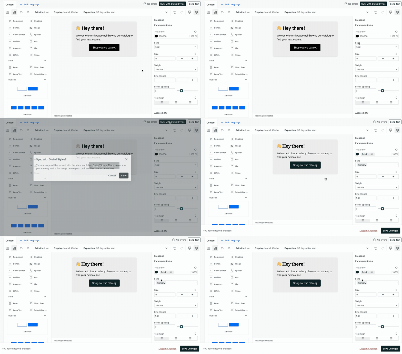
- Open your in-app message.
- Click Sync with Global Styles.
- Click Sync. Syncing does not save the message; you’ll have time to review first.
- Review your message:
- Do the styles and formatting look correct? If not, you can edit the message further or click Discard Changes to go back.
- If something doesn’t sync as you expect, click and select your message background (click outside the message) to open Message properties. Click next to a property that you want using your global style. You’ll likely only run into this issue if you started an in-app message from one of our out-of-the-box templates.
- Click Save Changes. Any future sends of this message will include your global styles.
Set global styles on multi-button components
Single button components automatically use global styles. However, components with multiple buttons need an extra step to start using global styles.
To change the styling of multi-button components to match your global styles, you need to manually reset them in the message. After you reset and save, the styles will use global styles (and any changes to them) moving forward.
- Open your in-app message.
- Drag in a multi-button component or click one to open the properties panel.
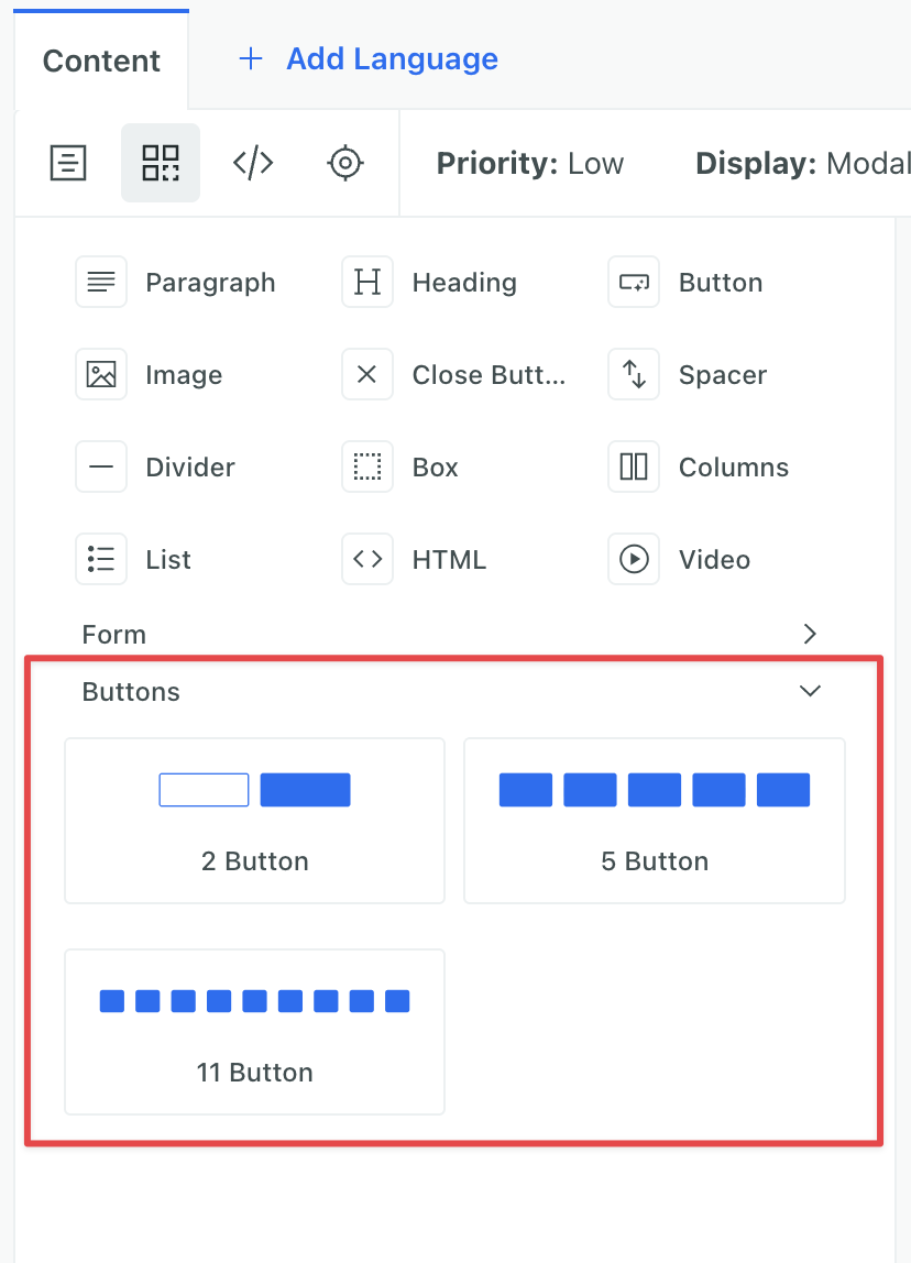
- Find a property that was modified in your global styles and click . The button preview will now show your global style. Do this for each property you modified in global styles, like Fill, Hover, etc.
- Click Save Changes. Any future sends of this message will include your global styles.