

Reports
On the Reports page, you can define the specific report criteria you want to see and compare your automations, one-time sends, and broadcasts.
Reports let you retrieve data from Automations and Broadcasts based on common tags or naming conventions. With reports on the Reports page, you might:
- Locate your top performing marketing automations.
- Analyze deliverability of all your transactional automations together.
- Compare journey volume and performance of two similar automations.
Each report might take a few seconds to run and will automatically run again when you change the report criteria. After results are returned, however, you can toggle any of the display options you’d like without re-running the full report.
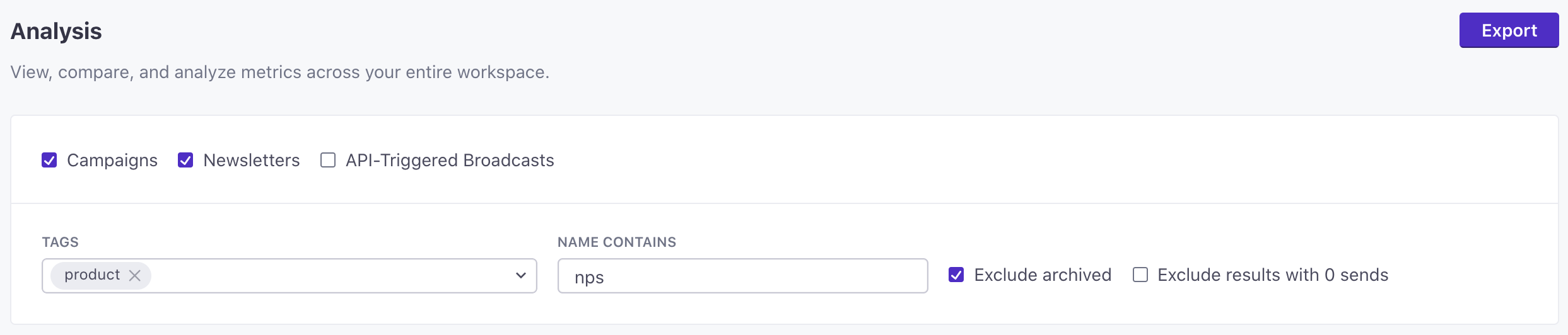
Take a closer look with our walkthrough:
Table view
The table view of a report displays every Automation, One-time send, or Broadcast that met the report criteria in a table format. The top row of each report shows the cumulative total for all rows in the table. This allows you to understand the performance of an entire category of messages.
In the table view you can display any five metrics columns at a time, for any channel you prefer. Each column can be sorted, giving you the ability to locate top and bottom performing Automations or Broadcasts.
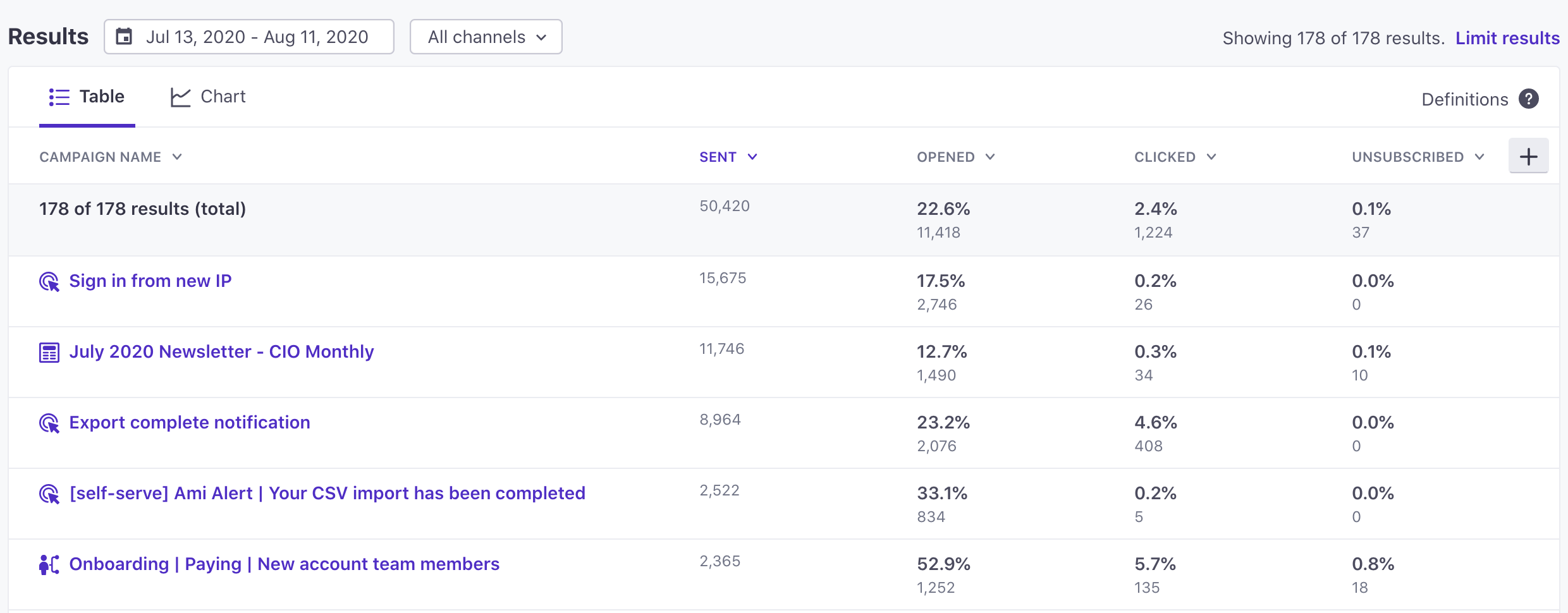
Chart view
The chart view of a report allows you to view metrics over time for the Automations, One-time sends, and Broadcasts that met the report criteria. You can view one metric over time for each Automation, One-time send, and Broadcast using the “Individual” chart type, or you can view the cumulative metrics of all results over time using the “Aggregate” chart view.
Both chart types can be viewed with percentage values or raw counts, grouped by daily, weekly, or monthly totals, and filtered by channel type.
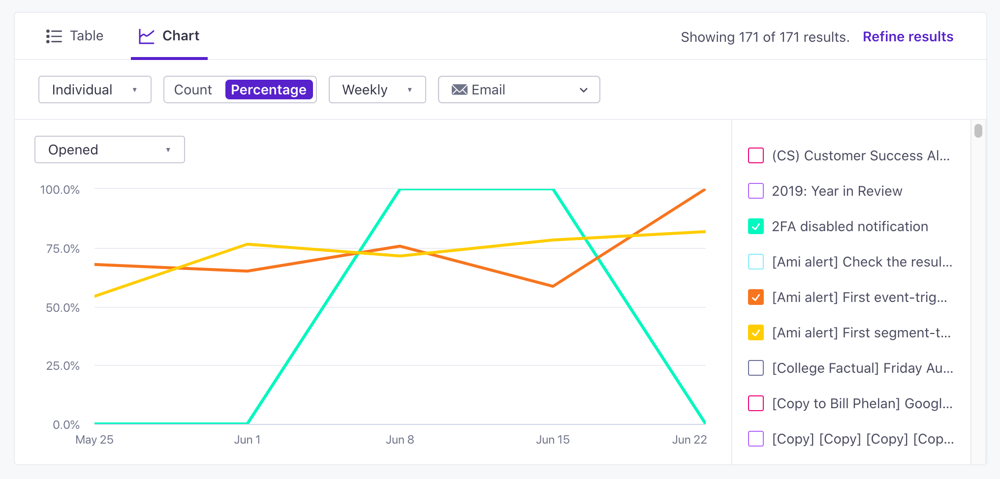
Chart human and machine engagement
On the Aggregate chart, Human opened, Machine opened, Human clicked, and Machine clicked are measures you can select, each with its own checkbox and its own line on the chart. Use them to trend bot-filtered engagement across everything in your report, rather than reading it one automation at a time. Read more about how we track human opens and clicks.
These measures apply to email only, so which ones you can select depends on your channel filter:
- Human opened and Human clicked are available whenever your channel filter includes email.
- Machine opened and Machine clicked are available only when email is the sole channel in your filter. We derive them by subtracting human activity from the total, and that total covers every channel you select, so a mixed selection would report other channels’ activity as machine activity.
The chart plots exactly the measures you select. Selecting Opened or Clicked draws the combined measure only; select the human or machine measure to plot it alongside, or on its own.
The Individual chart type is unchanged: it plots one measure per automation, one-time send, or broadcast, and shows human and total values when you hover over a point.