

Get started with the visual editor
In Design Studio, you can create an email with visual blocks, no coding necessary.
Here’s a quick guide to what’s available in the visual editor, and how each part helps you build your message. The editor has four key areas—the Insert and Layers panels on the left, the Canvas in the center, and the Properties panel on the right. Together, they let you add and style content without code.
For more on previewing your message for accessibility and responsiveness, check out Preview email in Design Studio.
If you get stuck, reach out to our agent! Click at the top of your workspace to get started. The agent can create or edit Design Studio emails at your request.
Add blocks to your message
You can find the content blocks you’ll use to build your email in the Insert menu. We offer two types of content blocks: standard and custom components.
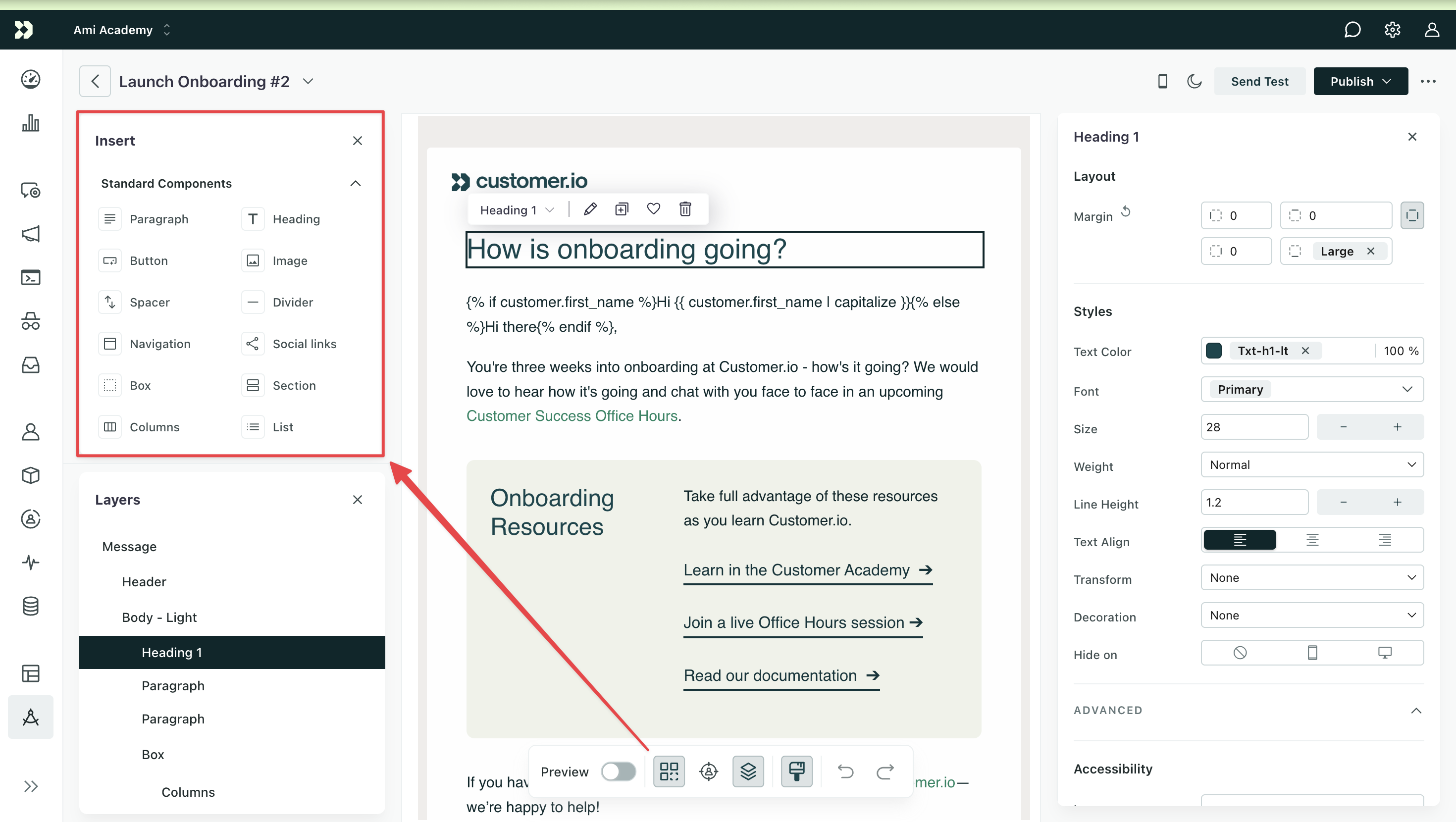
Standard components include out-of-the-box elements like headings, paragraphs, and buttons. Use these to quickly structure and style your messages. Custom components are reusable blocks of content created by your team. You won’t see custom components in the menu until you’ve created your first one.
Click, hold, and drag one or more content blocks from the Insert menu to drop them onto the Canvas, where you build your message. You can also type / in a text block to open the slash command menu and insert a component from your keyboard.
For Custom components, hover over or focus an item and click the info button to preview a live rendering before you insert it.
Navigate your layout
The Layers panel sits below the Insert menu in the left column and shows the structure and nesting of your components at a glance. From here, you can reorder components as well as rename, duplicate, or delete them.
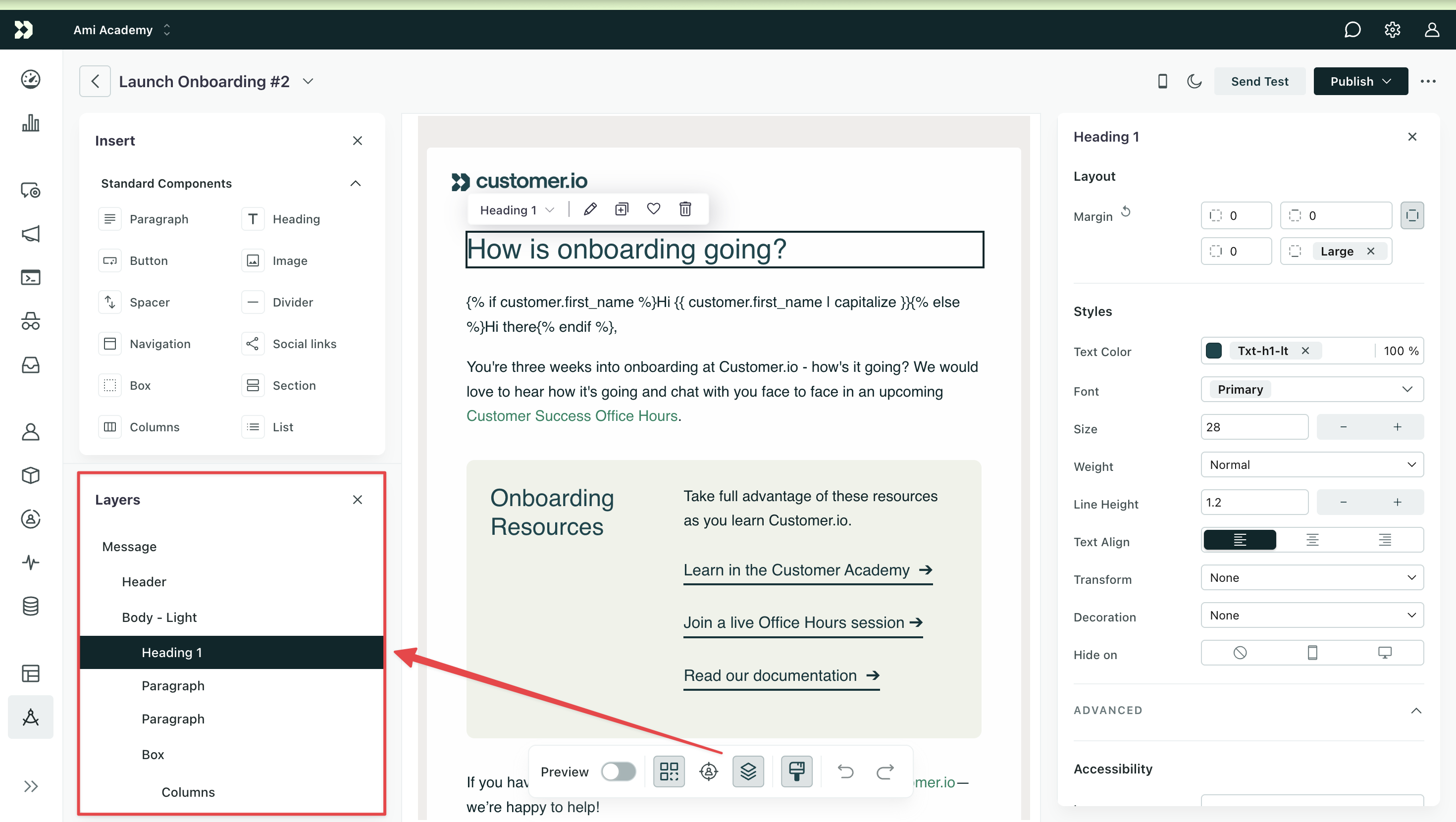
Click a component to highlight it on the canvas and open its properties. You can also click and drag a component in the Layers menu to change the order.
Hover over a component and click to rename, duplicate, or delete the layer. For instance, if your email has multiple Section components, you might relabel each to differentiate the parts of your email.
Build your message
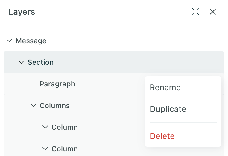
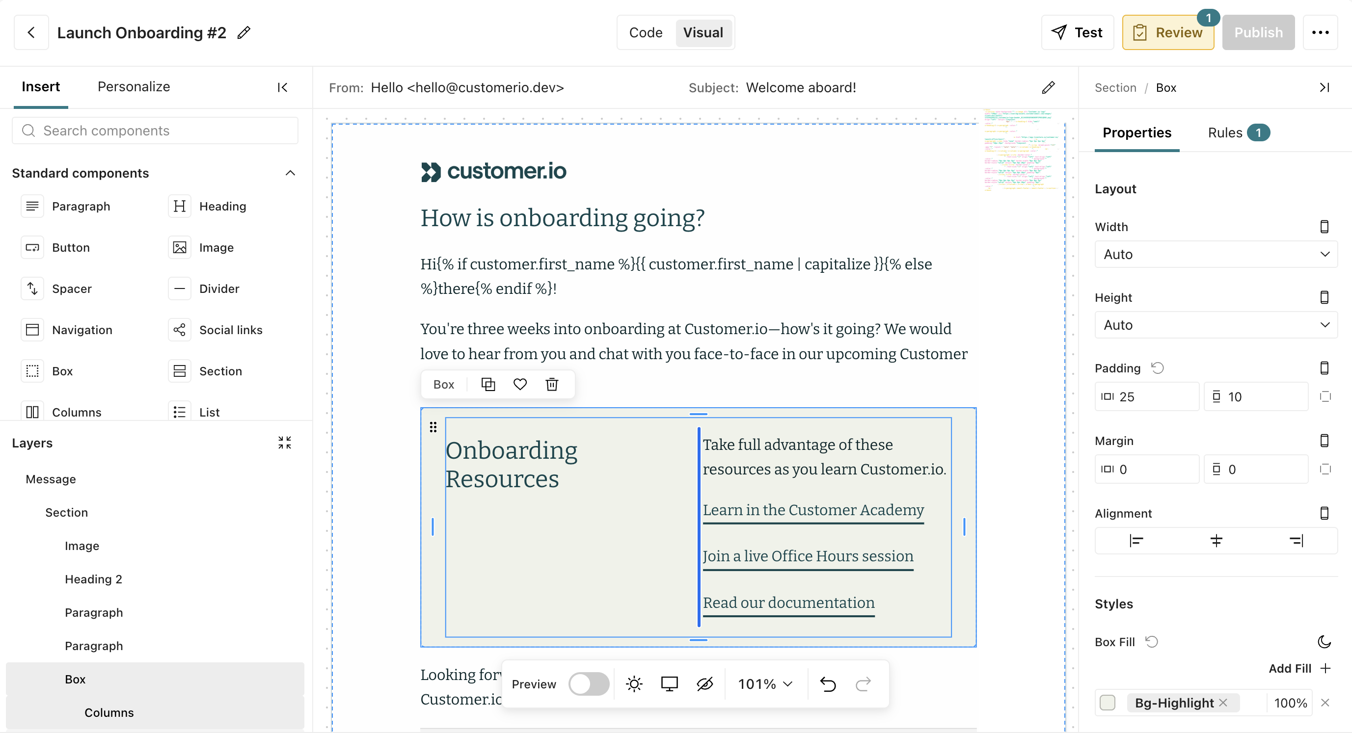
The Canvas is where you visually build your message. Your email sits on a zoomable artboard on a dot-grid board—similar to the Automations workflow builder. The artboard auto-sizes to your email’s height, and the canvas background follows your email’s color scheme. Pan and zoom to inspect pixel-level details or see the whole message at once.
View a list of keyboard shortcuts for zooming, formatting, and editing by clicking > Keyboard shortcuts.
To duplicate or delete a component, select it and choose the action from the context menu.
To style part of your text, highlight the text then modify the marks available, like color or italics, in the bubble menu. For broader styling, use the Properties panel.
Use the floating toolbar to switch viewports, toggle dark mode, toggle hidden content, undo or redo your work, and preview your message for different devices, color schemes, and visual impairments. Use the Code / Visual toggle in the header to switch between editors.
Add and arrange content
- Drag components from the Insert menu, or type
/in a text block to insert a component from the slash command menu. - Grab any block by its body and drag it to reorder—no need to find a drag handle first. Dragging a selected block moves the whole selection.
- Drop a block on another block’s left or right edge to wrap both in a new row.
Personalize and find content
- Type
{{anywhere in text to open Liquid tag autocomplete based on your sample data. - Type
:nameafter a space to search for and insert emoji inline. - Press Cmd/Ctrl+F to open find and replace. Matches highlight across formatting, and the canvas pans to show the current match.
Upload & optimize images
From the visual editor, you can choose media that’s already been uploaded to your workspace (in your Assets library) or upload a new file as you build your message.
If you upload a file larger than 2 MB, you’ll need to optimize the image to compress it while maintaining visual quality. This helps reduce the time it takes email clients to load your messages, including with poor internet connections. Keep in mind, it’s best to keep images under 1 MB.
- Add an image-based component to your canvas.
- Click Choose or Select Media.
- Click Upload file.
- Select the file you want to upload.
- If your file is larger than 2 MB, you must click Try optimizing. Otherwise, optimization is optional.
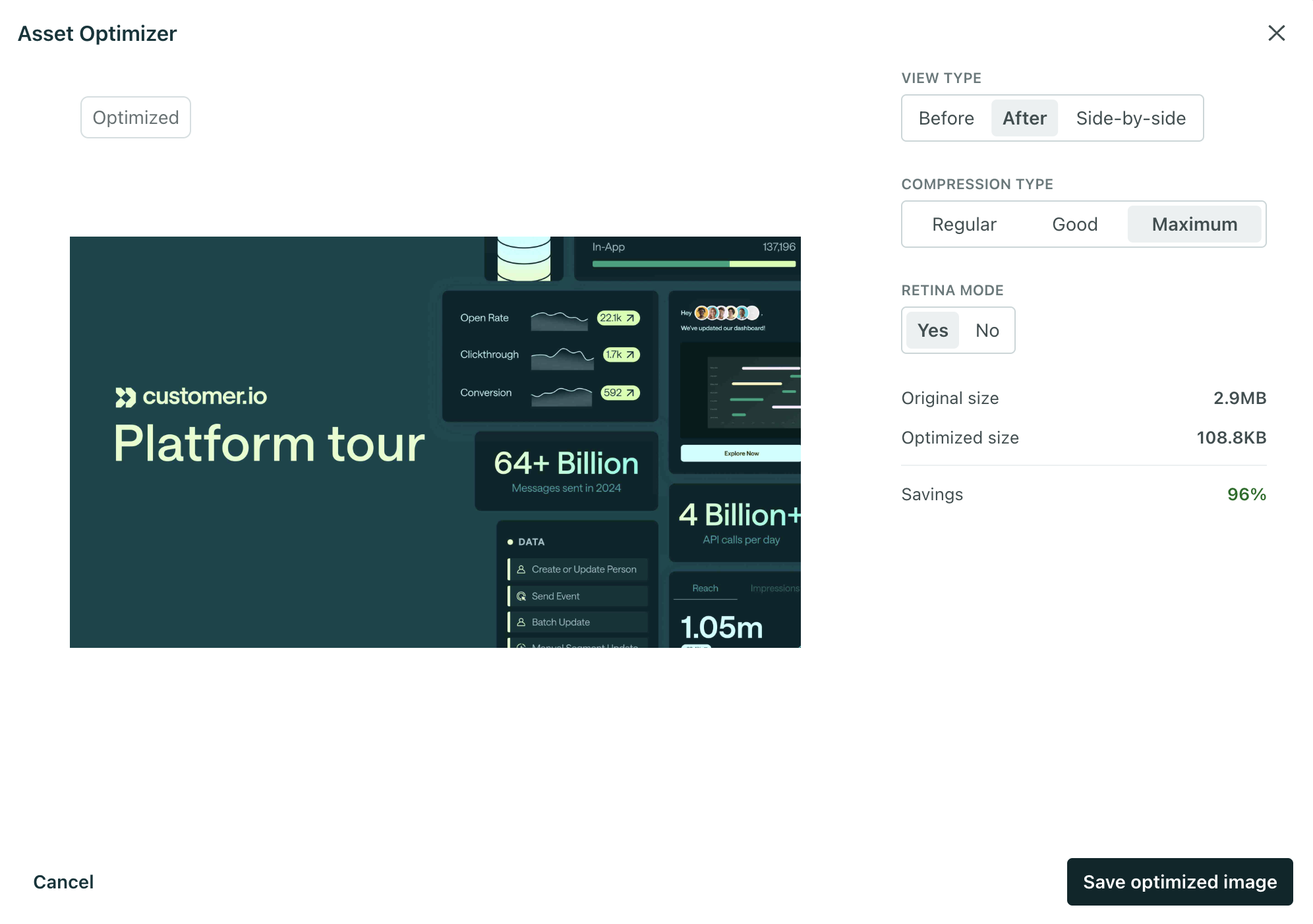
- Adjust the settings to your liking:
- Use View Type to compare the original image against the optimized version.
- Use Compression Type to balance file size vs. visual fidelity.
- Use Retina Mode to manage pixel density for high-resolution screens.
- Compare the size of the original to the optimized image.
- Click Save optimized image.
You can optimize images in Design Studio or from the Assets page. Optimized images appear in Assets for use in other messages.
Translate your message
You can add translations to any template or email in Design Studio. If you’re familiar with localization in our other editors, it’s the same process.
- Store people’s language preferences as an attribute.
- Tell Customer.io what attribute you use for audience’s language preferences.
- Create your default message and add translated versions in the email editor.
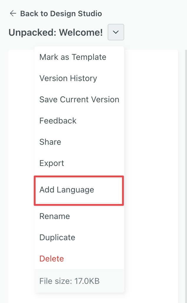
To add a language, open a Design Studio email, click next to the email’s name, and select Add language to get started.
If you use our Auto-translate with AI tool, it will translate the following:
- Body text
- Subject lines
- Preheader text
It will not translate:
- Liquid: Attribute values, filter values, any text rendered by a conditional, etc.
- Images, but it will translate alt text
- Snippets: Rather, you should add liquid conditionals based on language preferences to the snippet file.
- Text in custom components: However, our AI tool will translate the text if you detach the component first, and then translate the message. Learn more about detaching a component from its source file.
Learn more about setting a language attribute and translating content with AI in our localization guide.
Style your message
The Properties panel is always open on the right. Use it to style your components—change layout like margin and padding, text styles, add links to images, and more.
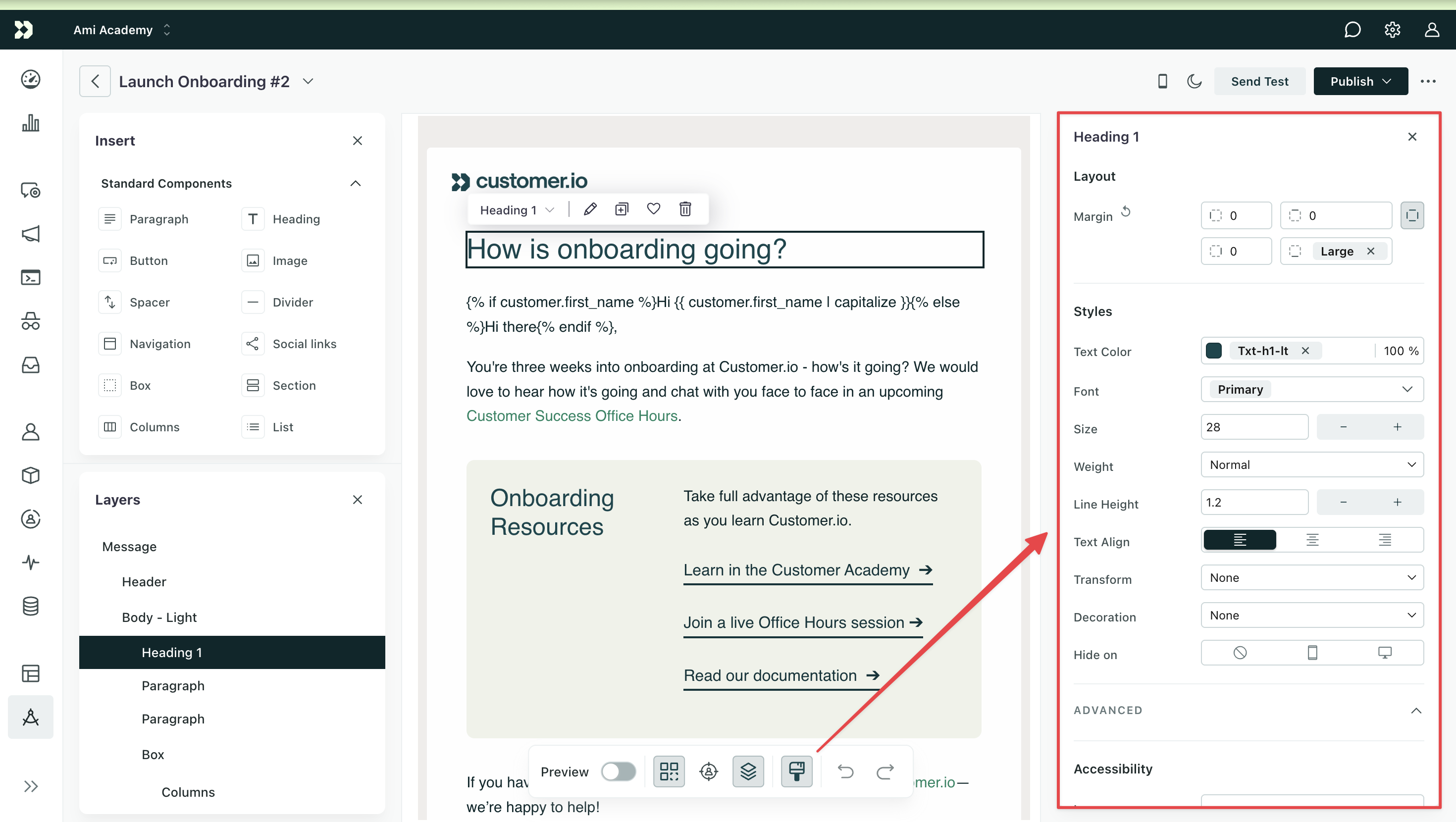
You can also style components from the canvas:
- Columns—Drag the gutter bars between columns to adjust widths. Columns snap to a 12-column grid when you’re close to a grid line.
- Corner radius—Drag the dot in a block’s top-left corner to round all four corners.
- Padding—Drag the grip pills on each side of a block to set padding for the active viewport (desktop or mobile).
Edit multiple components at once
You can select multiple components then edit shared properties or move them in your email to speed up email creation.
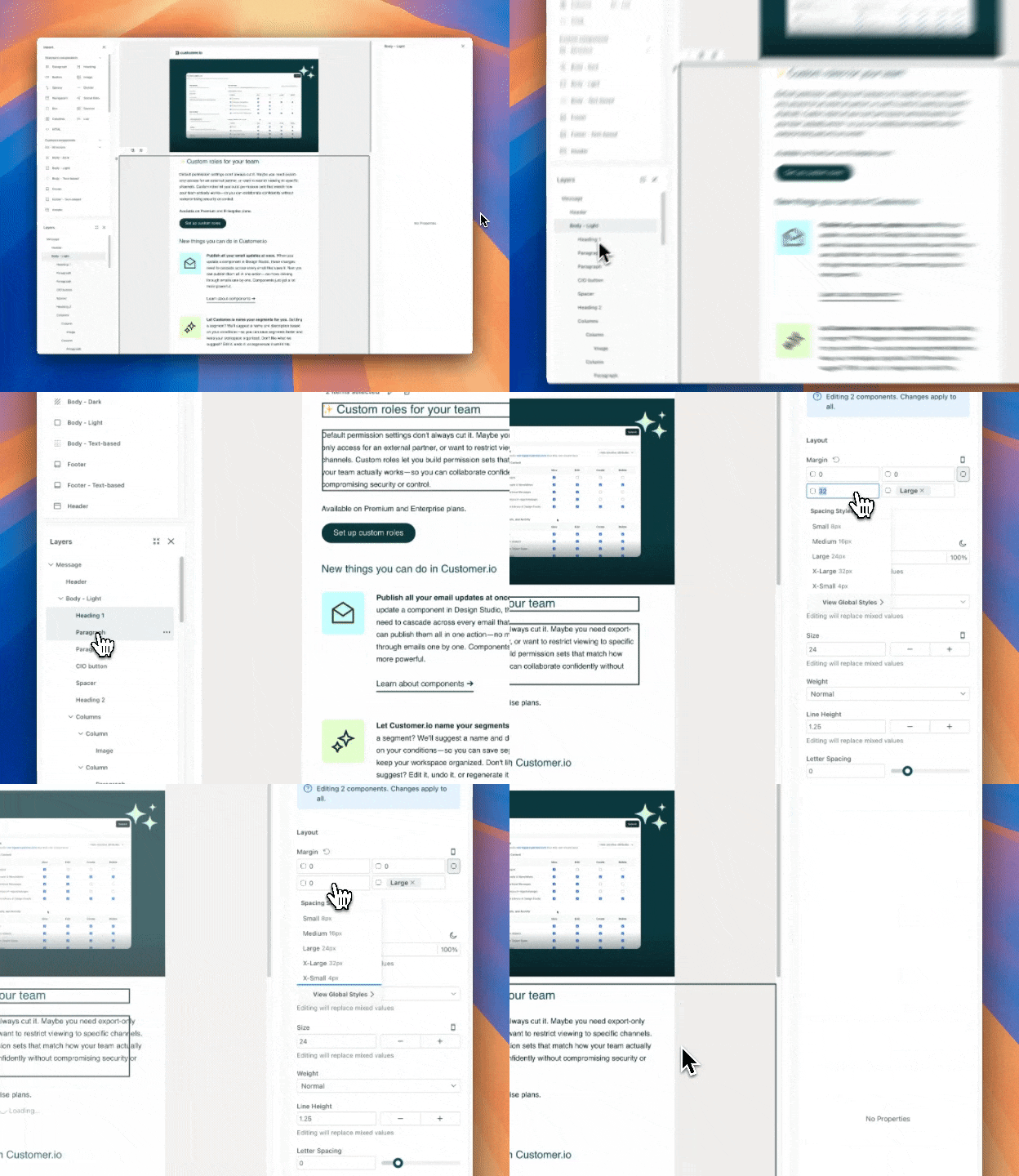
To make edits across multiple components, you have two options:
- Under Layers, hold Shift and click each component.
- On the canvas, click and drag your cursor to select multiple components.
Edit shared properties
After you select multiple components, you can edit their shared styles in the visual editor. This way you can apply identical settings like margins across paragraphs, columns, and more, rather than spending time individually modifying them.
If you don’t see a property when you select multiple blocks, then the setting doesn’t exist for one or more of the components you selected. You’ll modify that setting separately.
Move multiple components
After you select multiple components, grab any selected block by its body and drag your selection to another part of the canvas.
Message properties
Use Message properties to style your email overall—set a background and default text styles for your message here. Click Message under Layers and choose Properties to get started. Behind the scenes, this styles the base component of your message.
By default, your global styles for paragraphs define the color, font family, size, weight, and line height set on your base component.
Make specific changes with the inline agent
Click a component and prompt the inline agent to make changes. This is typically quicker than using the workspace agent because it works inline without leaving the editor. Your general purpose agent has skills, context, and resources that span your workspace—all things outside the scope of things you might want to do in your message.
- Click a component on your email’s canvas.
- Select Prompt.
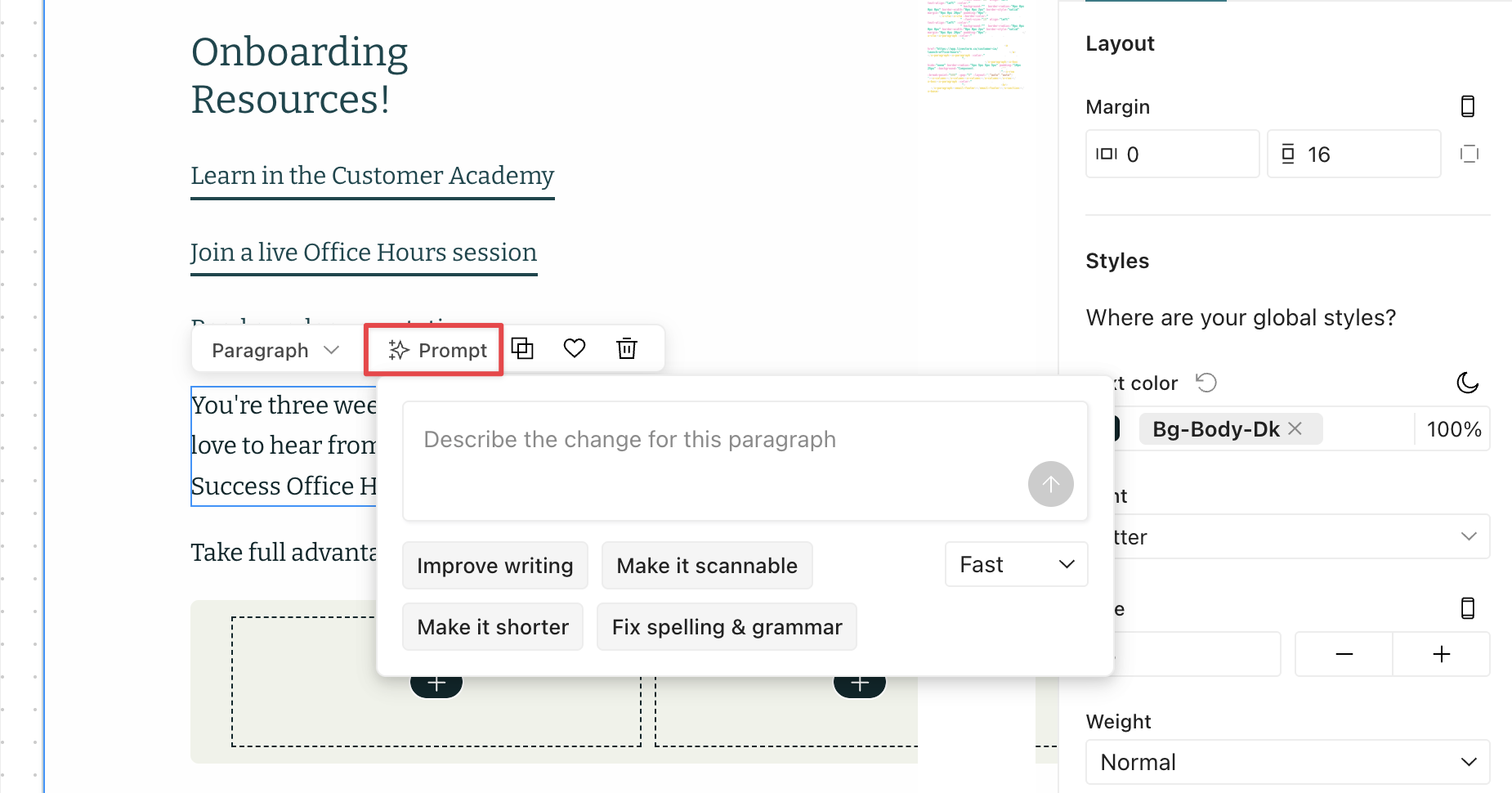
- Describe the change you want, like an adjustment from your primary to secondary color or adding alt text to an image. You can also choose one of the suggested prompts.
- Review the changes.
If you don’t like the output, revert it with a keyboard command (Ctrl + Z/Cmd + Z) or on the canvas floating toolbar.
Manage links
You can add links to text and components with images or buttons, like the Navigation block, to encourage people to take action.
- To add a link to text, highlight the text then select from the bubble menu.
- To add a link to a component, select the component then find Link in the Properties menu.
Then choose the right type of link from the dropdown: URL, Email, or Phone number.
- URL opens a link to a webpage. This is also how you add standard links—common liquid tags for unsubscribing and viewing the email in a browser.
- Email opens a recipient’s email client. You can specify a sender address, subject line, and email template.
- Phone number asks to start a call.
To preview your links, turn on the Preview toggle in the floating toolbar then click your components or hyperlinked text.
Standard links
Standard links are just that—common links needed for accessibility and compliance: view in browser and manage subscription options.
Within a Link field, click Standard links, and then choose the relevant link type. This adds a liquid tag which you can preview in the editor or when you send a test message. Learn more about these liquid tags below:
Disable link tracking for specific links
Learn more about disabling tracking on specific links within standard components.
Fill out the envelope
Fill out the envelope (subject, sender, recipient, etc) at the top of your message.
- Click at the top of your message.
- Fill out the envelope:
- From (Required): Learn how to add from addresses to your workspace.
- To (Required)
- Subject (Required): You can generate AI-powered subject line suggestions based on your email content and business context. Click next to the subject field to get multiple options that match your brand’s tone and audience.
- Title: Appears after opening “View in browser” links
- Preheader: Learn how to set custom preheader text
- Reply-to
- CC: additional recipients that are visible to all other recipients. Their opens, clicks, and bounces count toward your message metrics.
- BCC: Learn about Fake BCC.
- Custom headers: Learn how to set custom email headers and which aren’t allowed.